


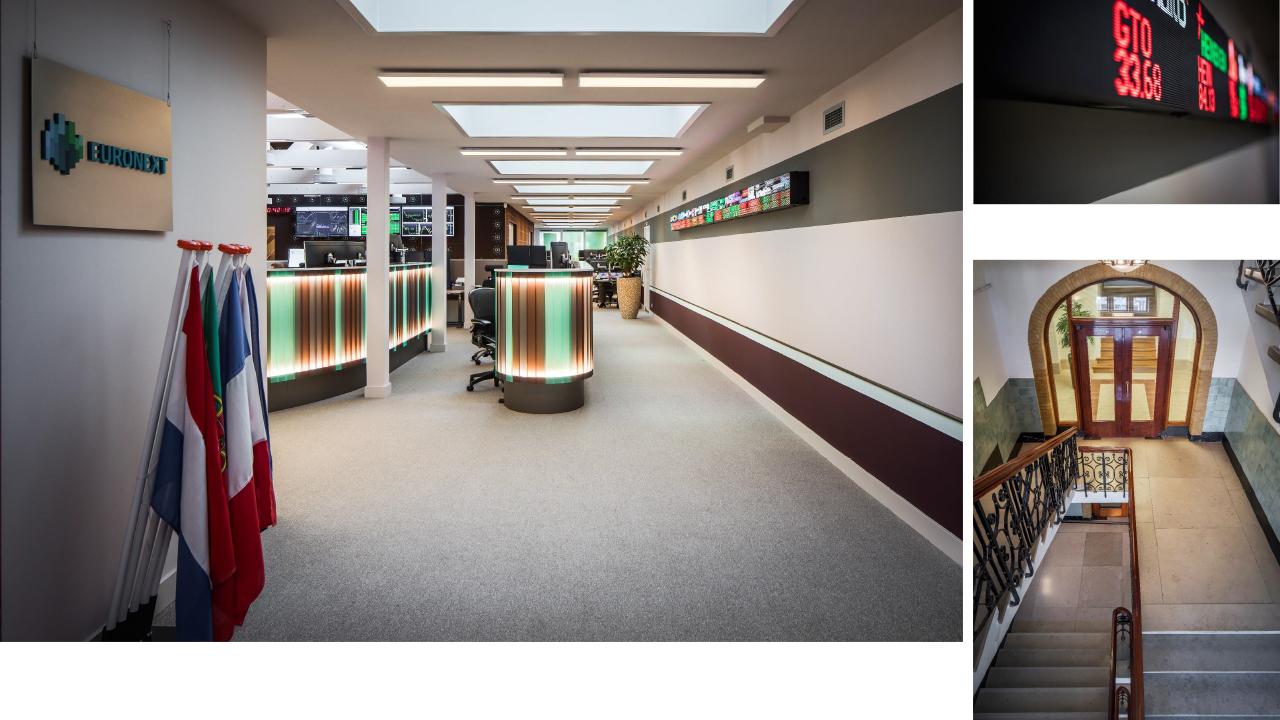
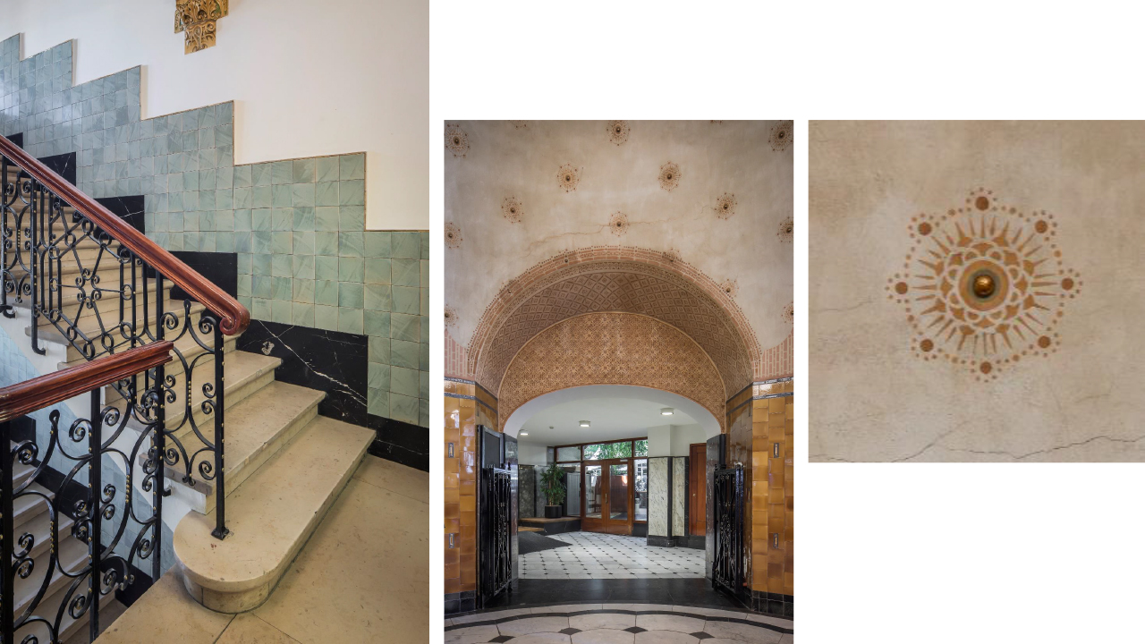
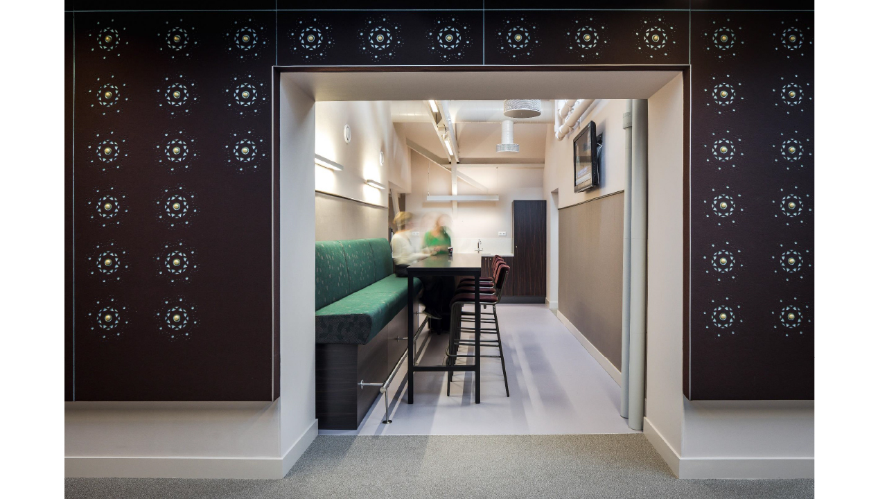
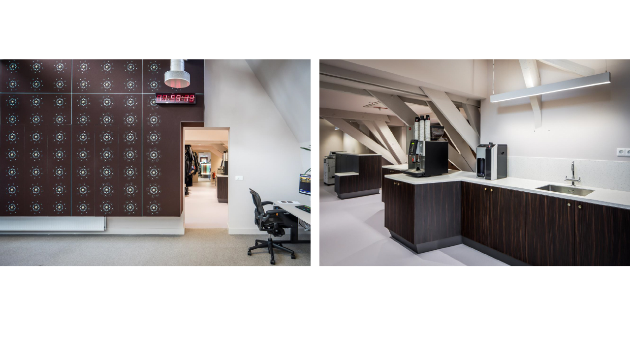
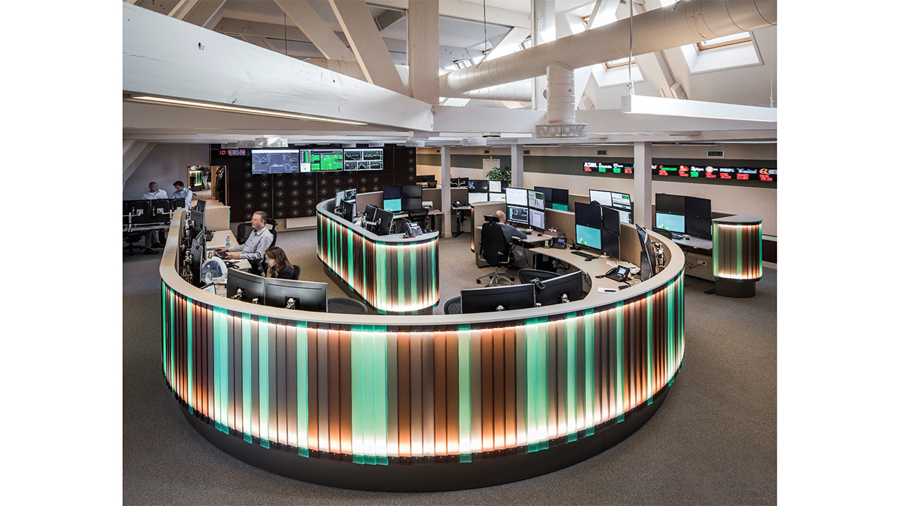
Euronext Amsterdam is the Dutch exchange, which is part of Euronext NV, the leading pan-European exchange in the Eurozone with alsmost 1.300 quoted companies. Euronext applies a federal marktet model and operates in p.e. Amsterdam, Brussels, Lisbon, London and Paris. The office is located on Beursplein 5 in Amsterdam, in the monumental building from 1912 designed by the well-known architect Joseph Cuypers. The EMS (Euronext Market Services) department ensures a fair and orderly conduct of the exchange. We were asked to reorganize their complex way of working located on the attic of the building. Because of the existing construction we designed a compact and efficient shape (“the snake”) in where the analyst do there focused work. We made a new interpretation of the original building style by reusing patterns, using derivative colours and modernise old materials. Even though the client wanted a WOW-factor when you enter the EMS area, we created a calm environment for the employees who are working under great pressure.
Category: portfolio
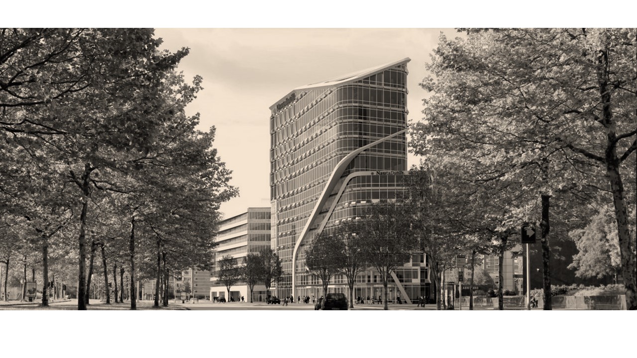
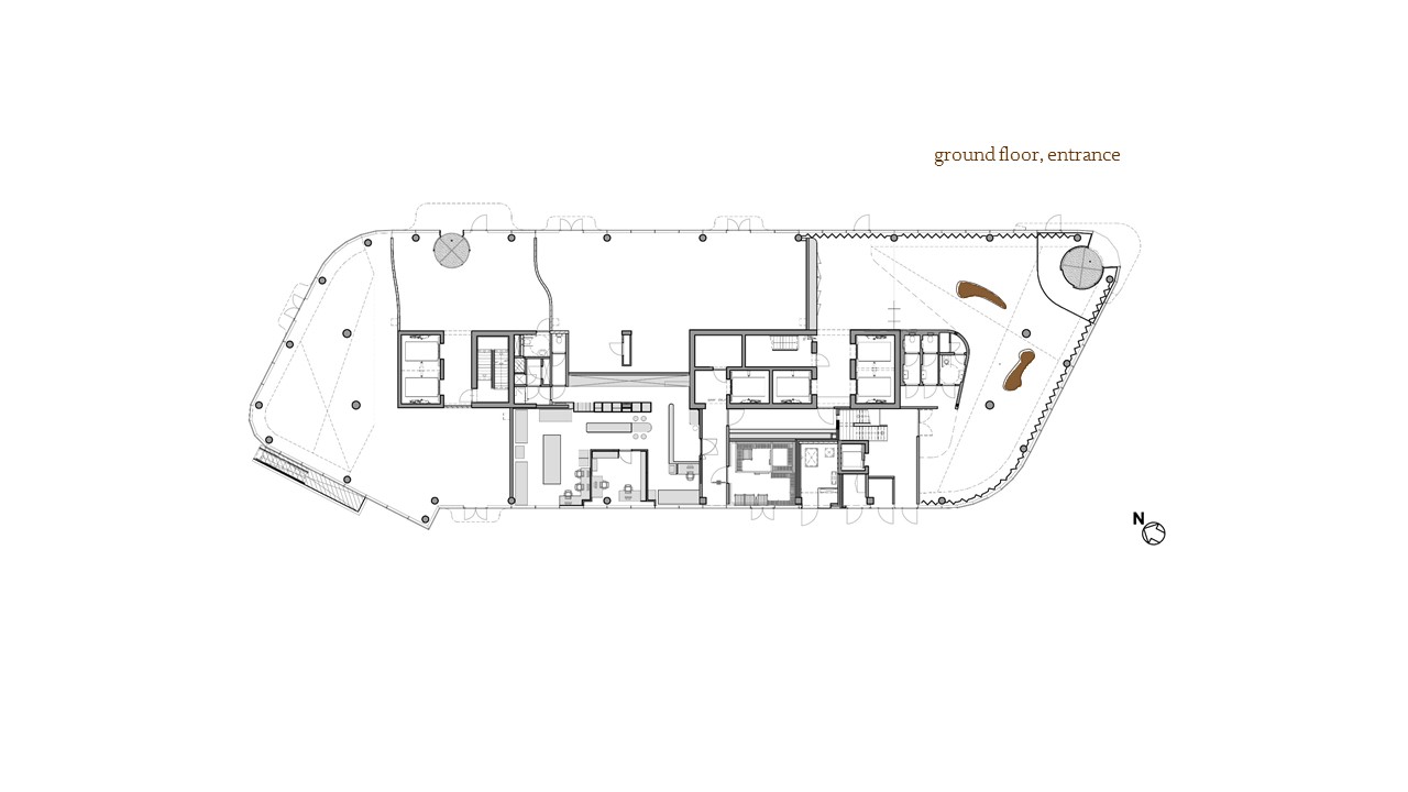
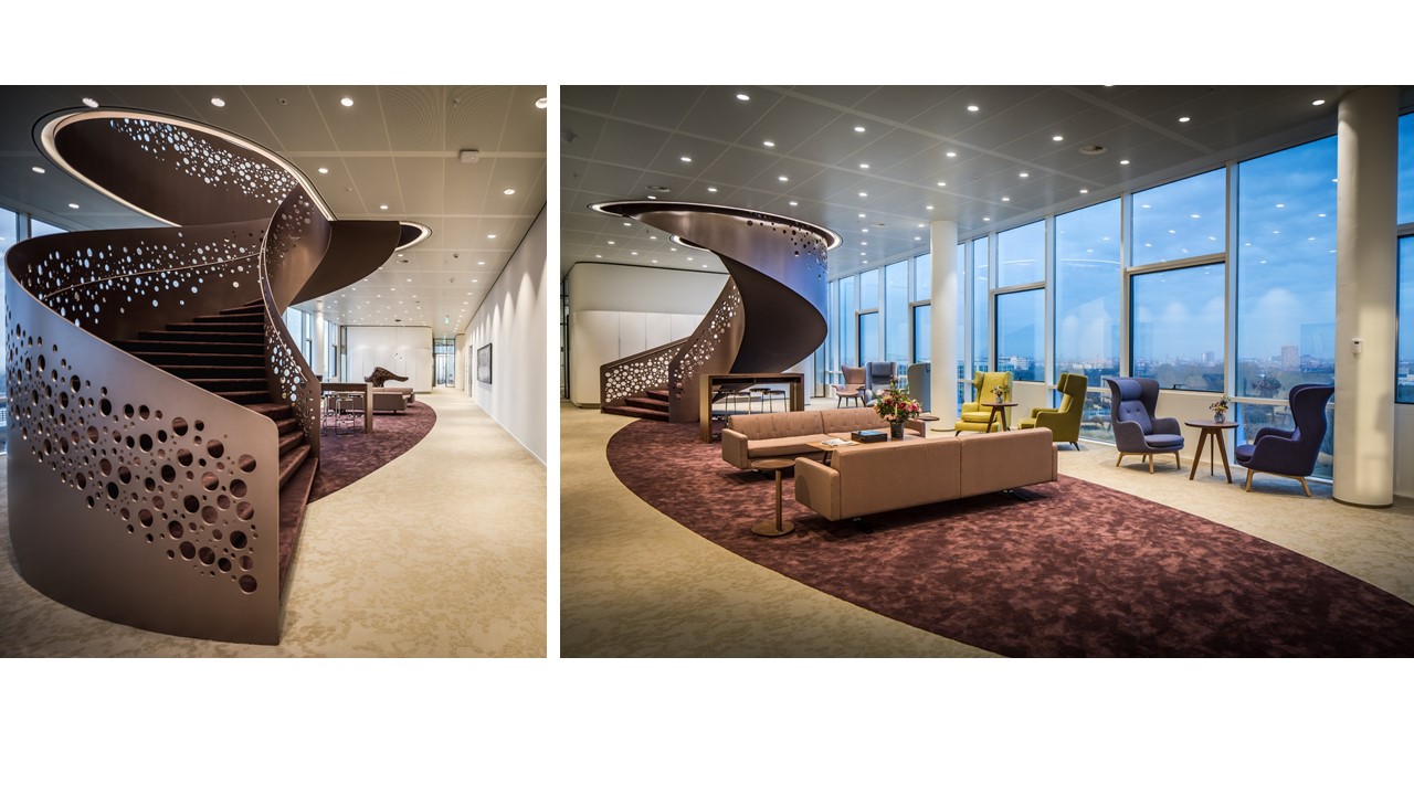
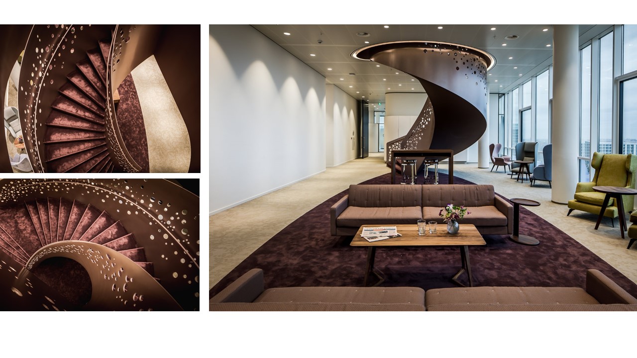
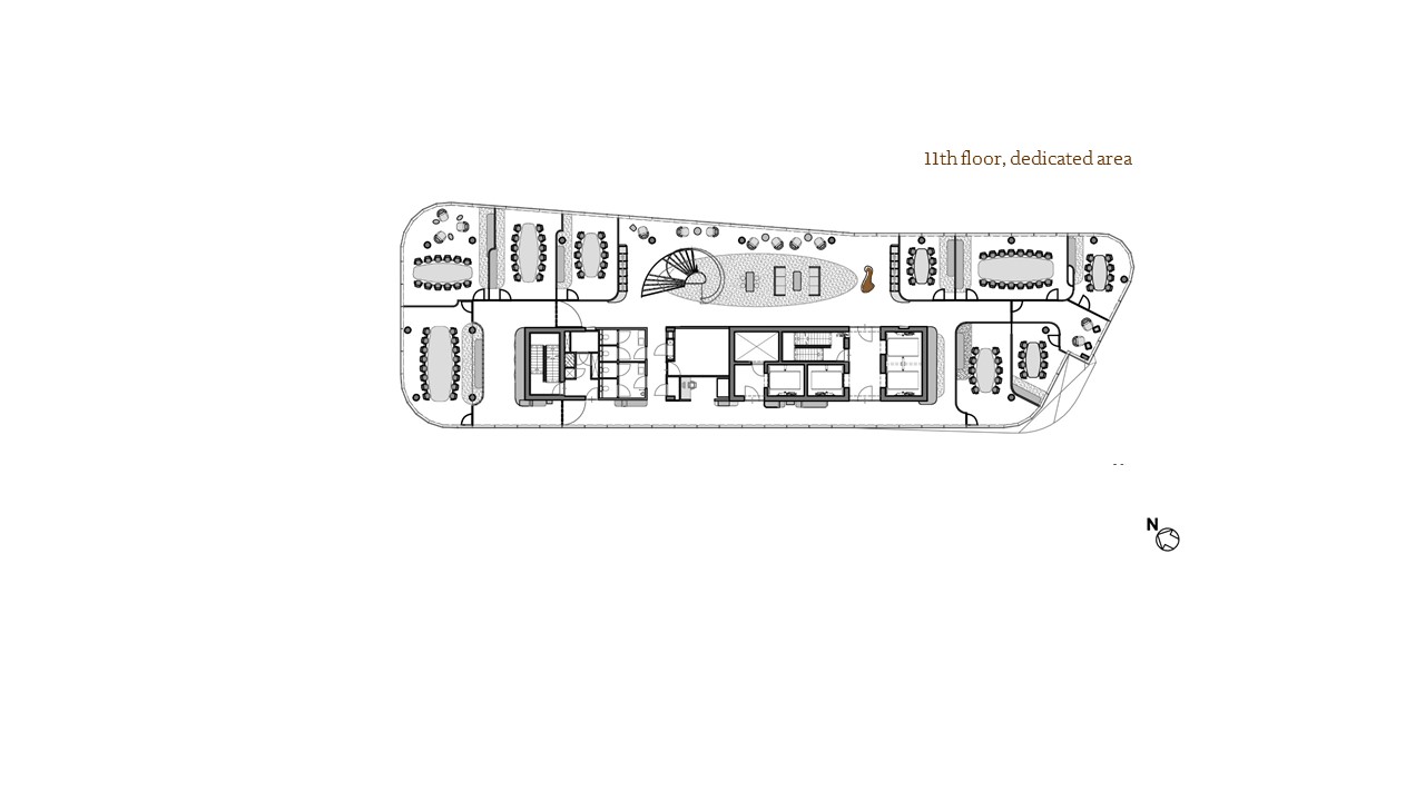
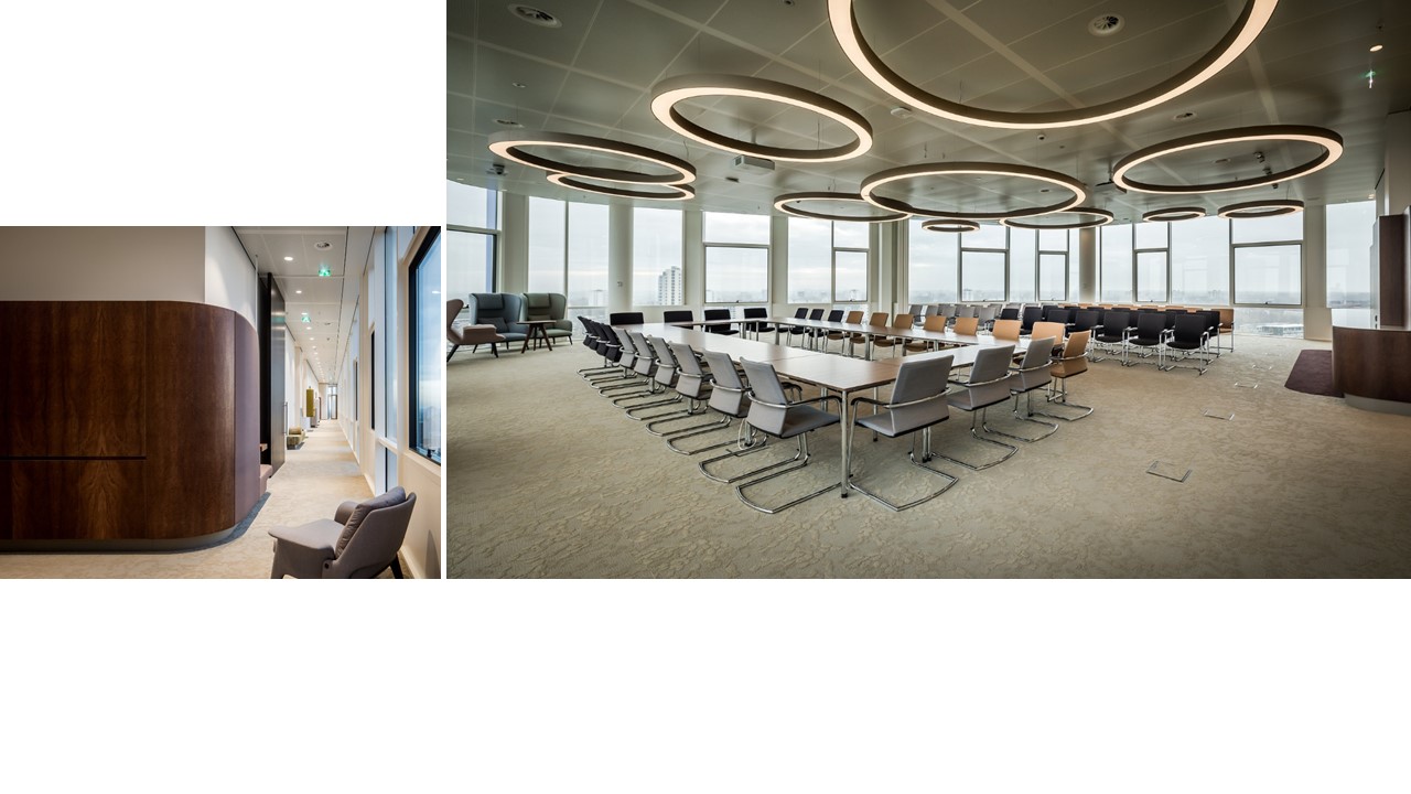
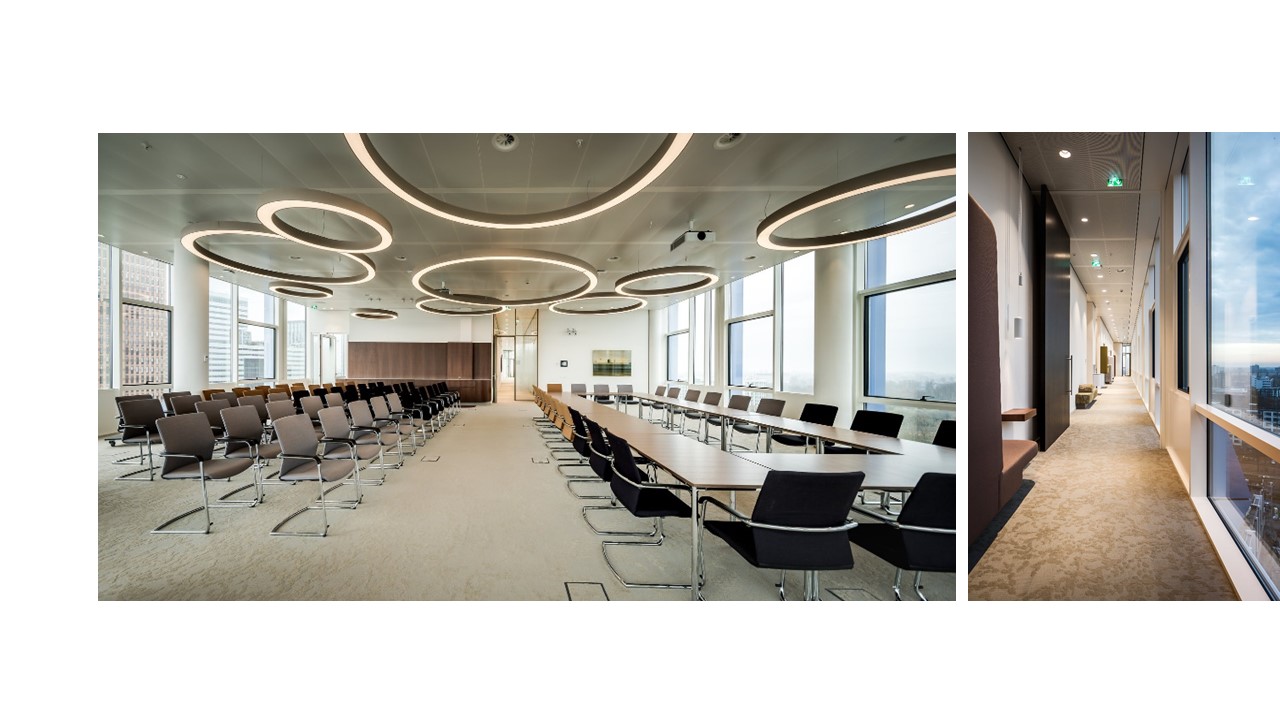
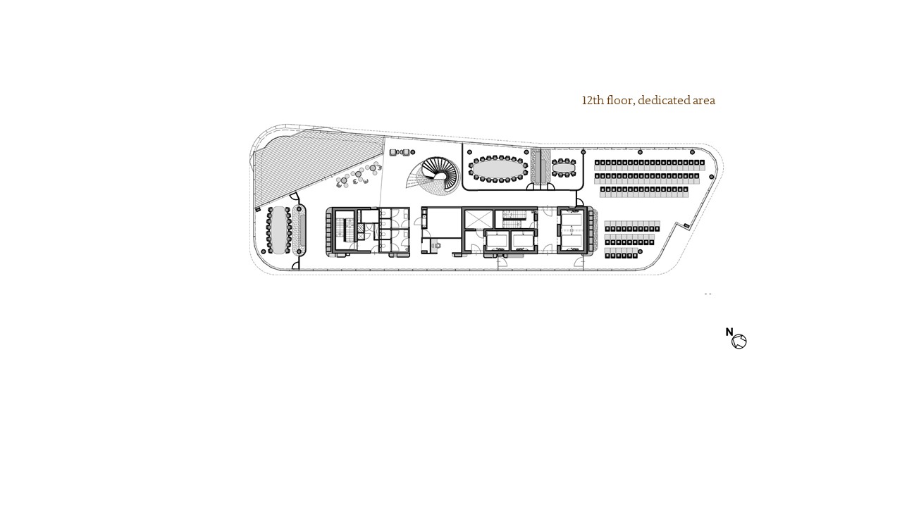
Interior NautaDutilh, Amsterdam


G&S Real Estate developed an entirely new building designed by UN Studio in Amsterdam’s SouthAx district. Medio September NautaDutilh moved into the 12.000m2 office. The project management is handled by the CBRE. DerksdenBoer Interior Architecture made in cooperation with Casper Schwarz Architects a “five-star interior” perfectly tailored to NautaDutilh.
Designteam: Casper Schwarz, Chanthal den Boer, Iris Derks
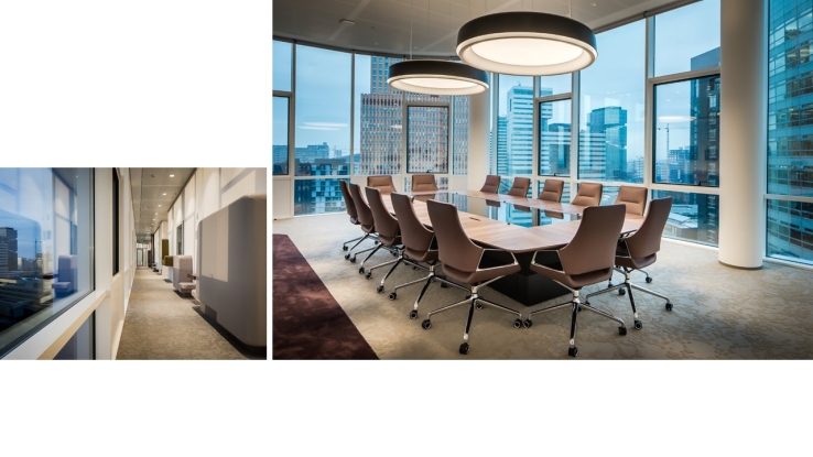
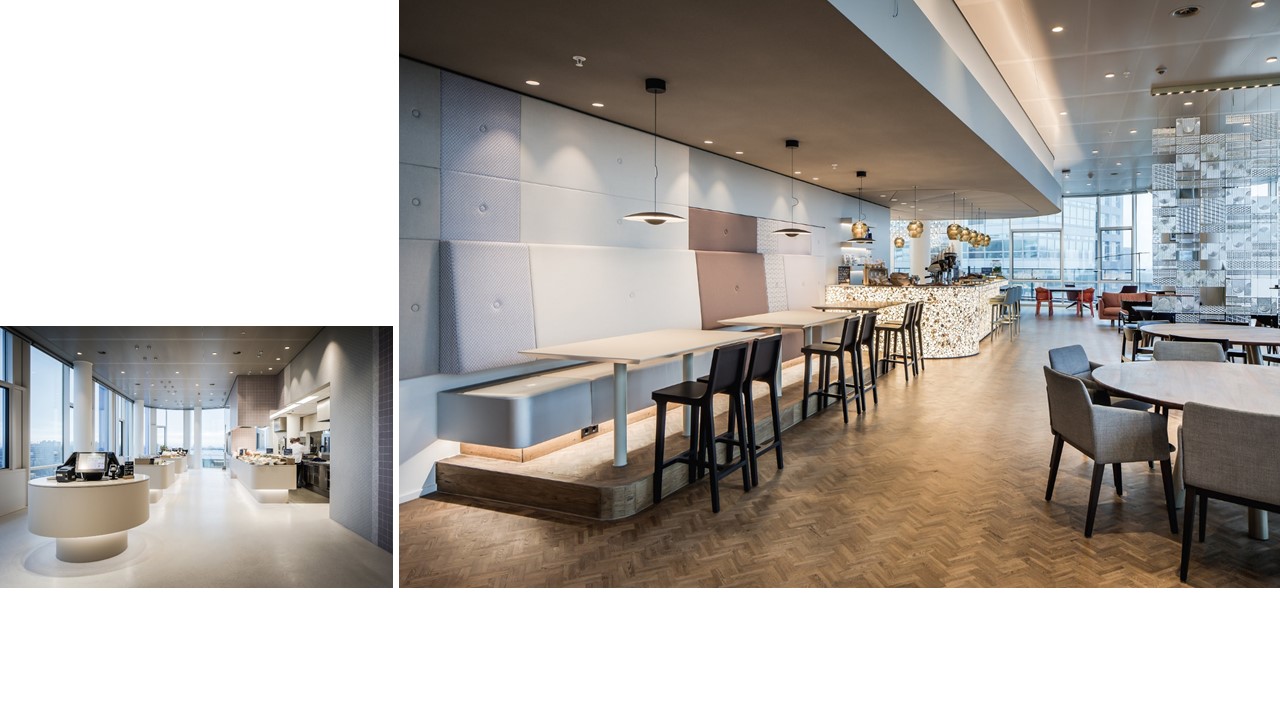
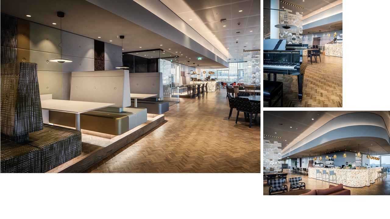
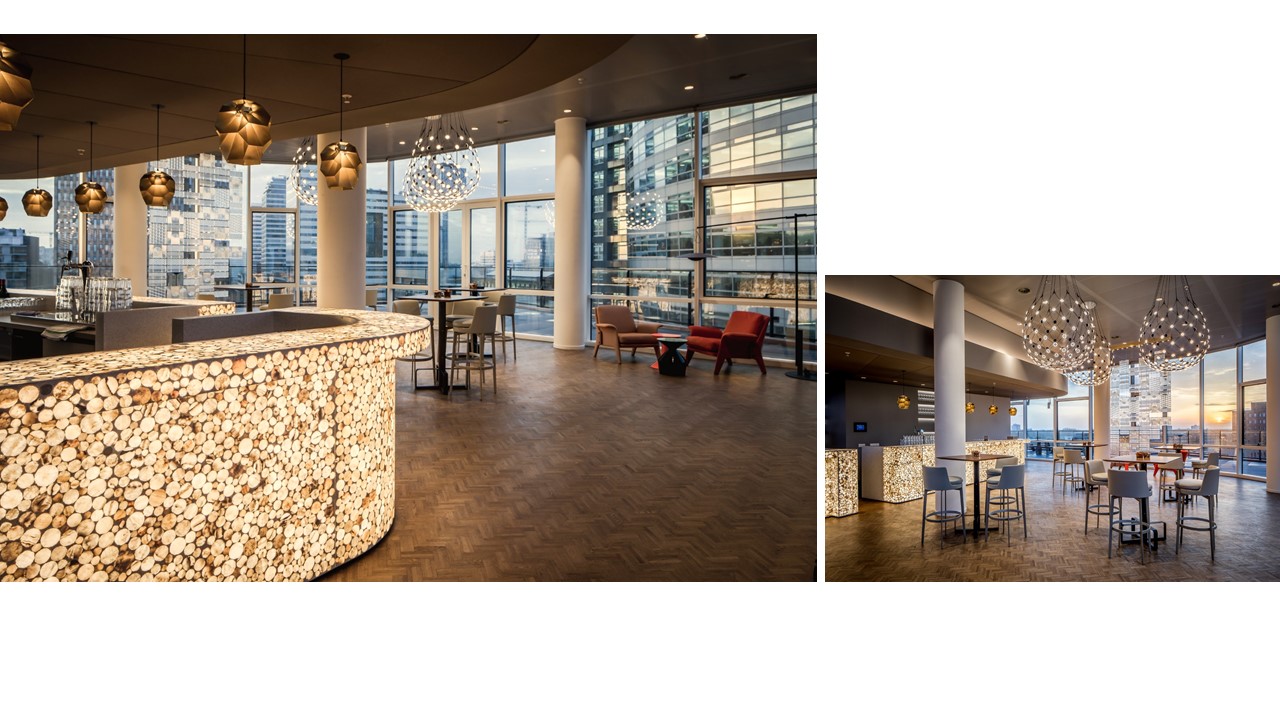
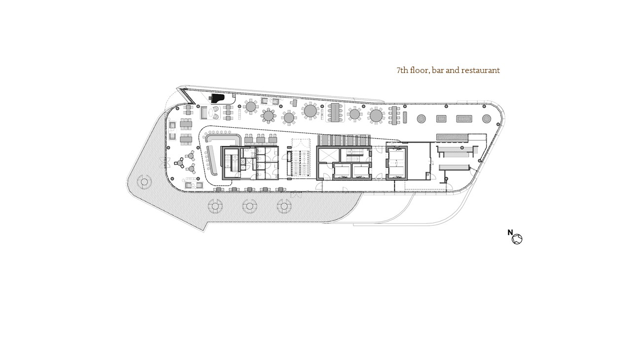
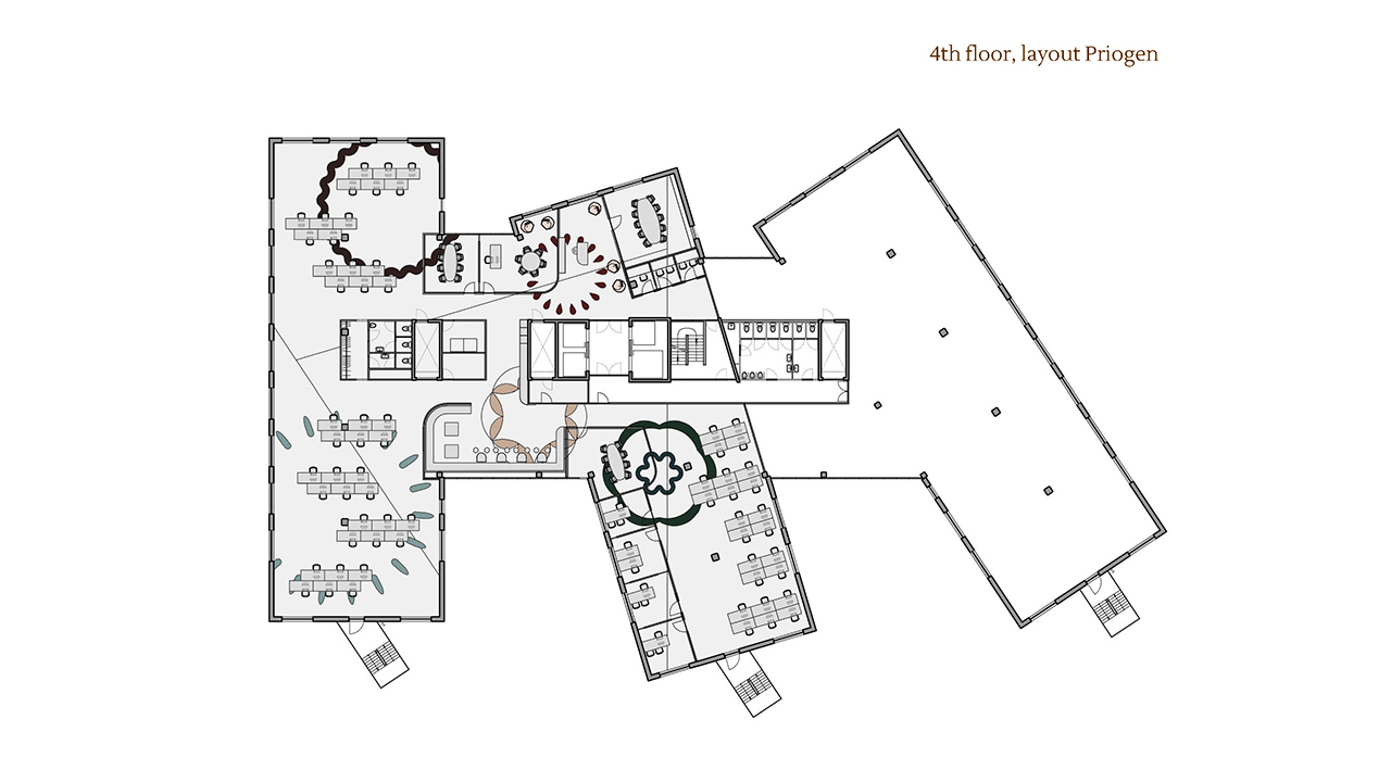
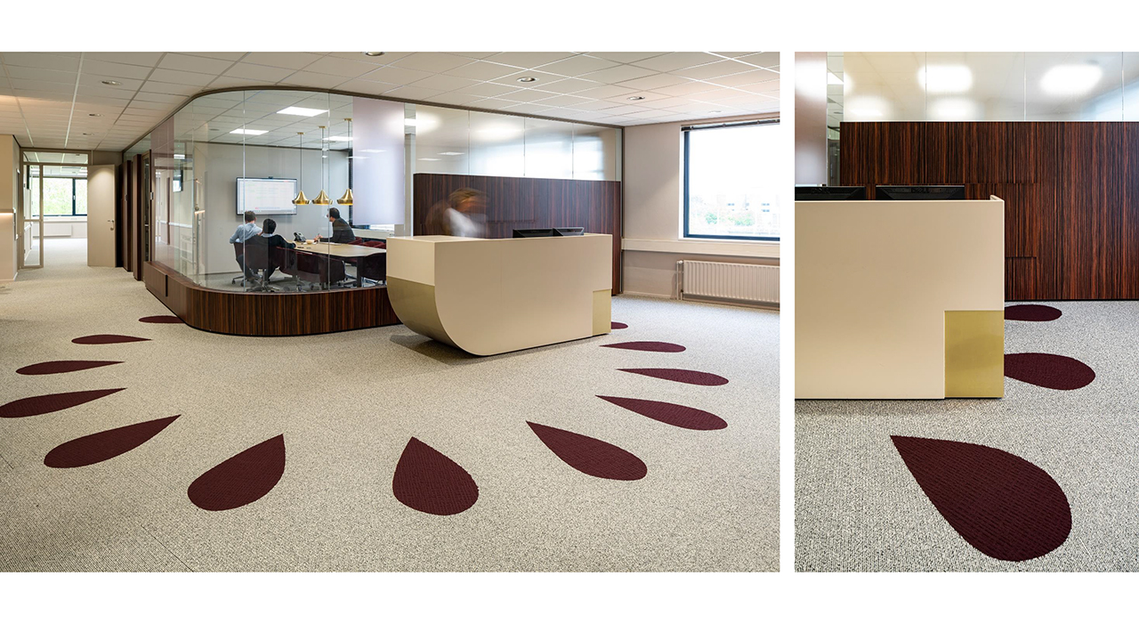
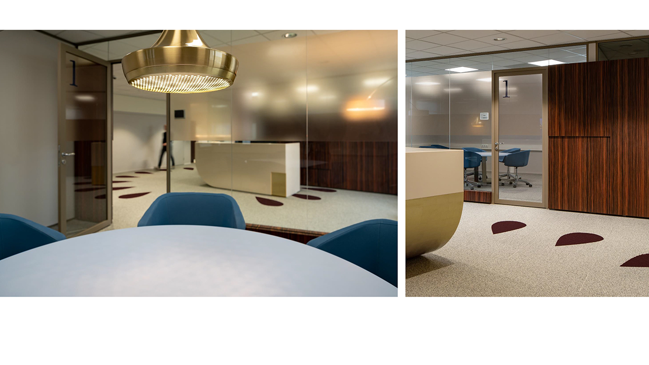
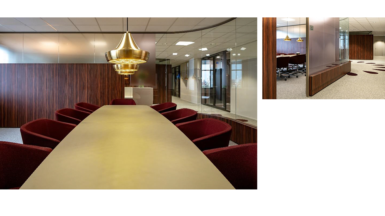
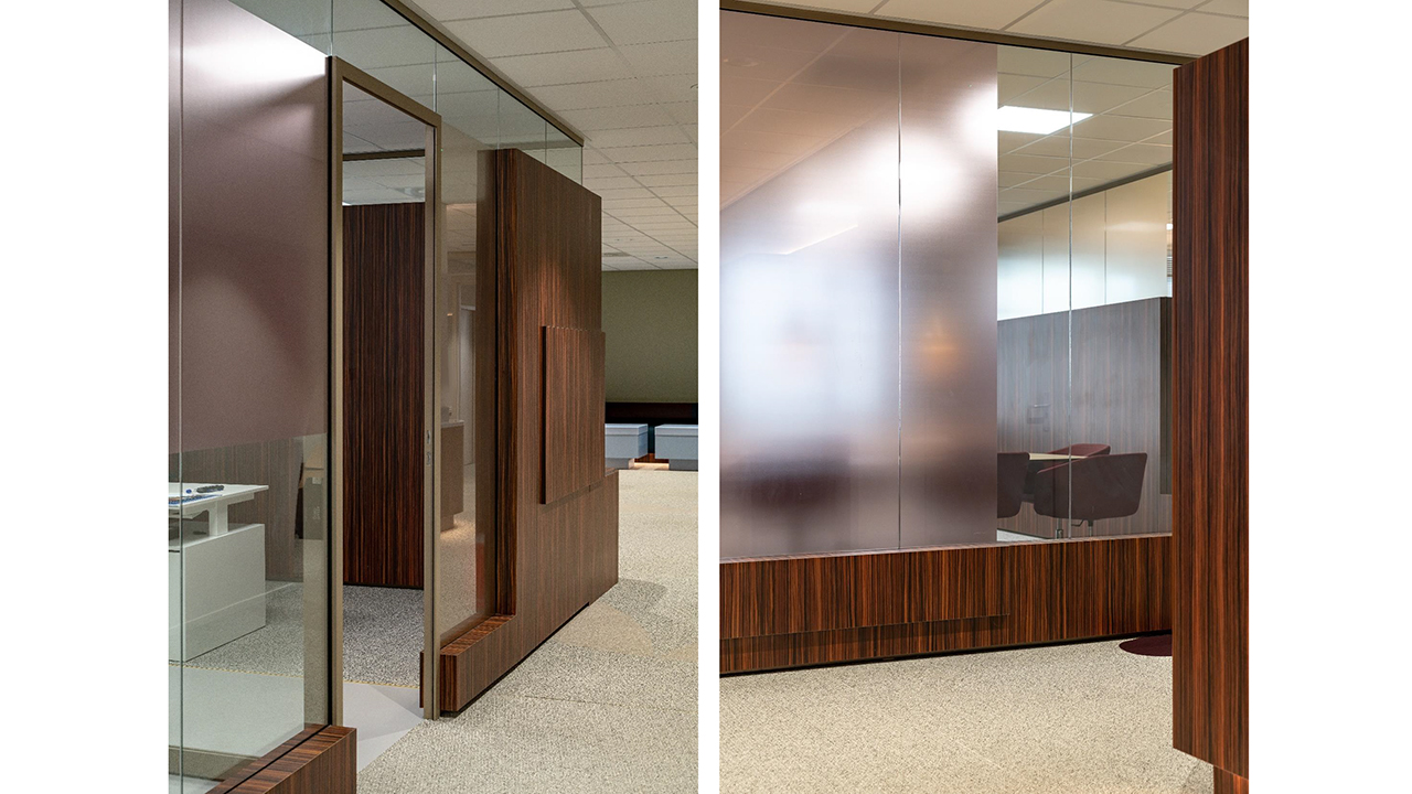
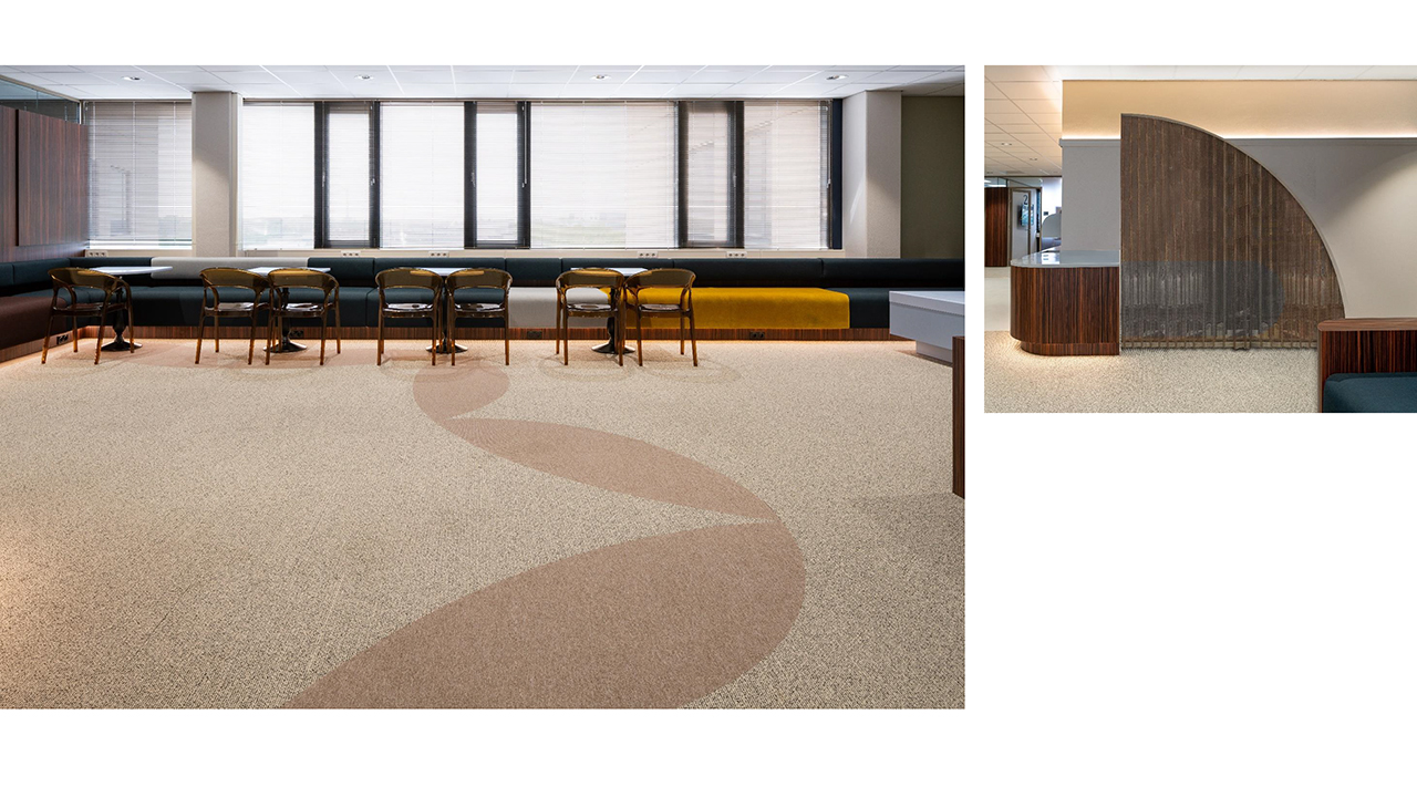
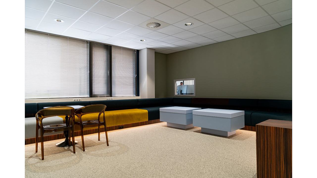
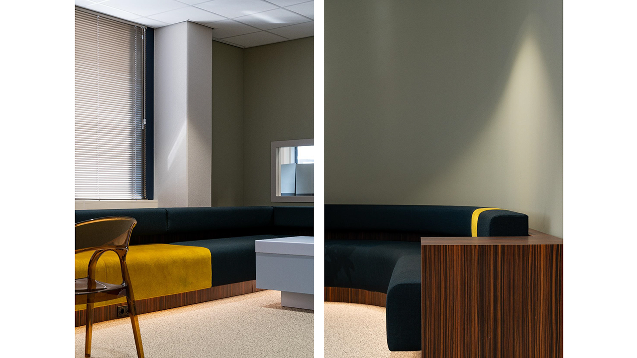
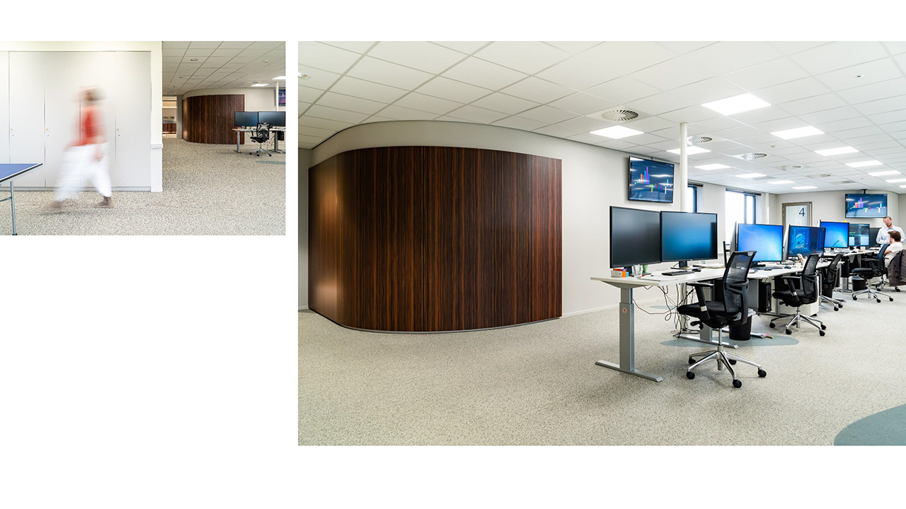
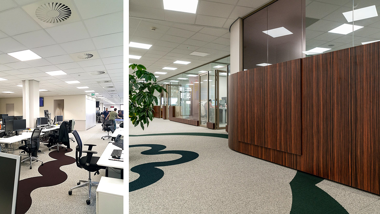
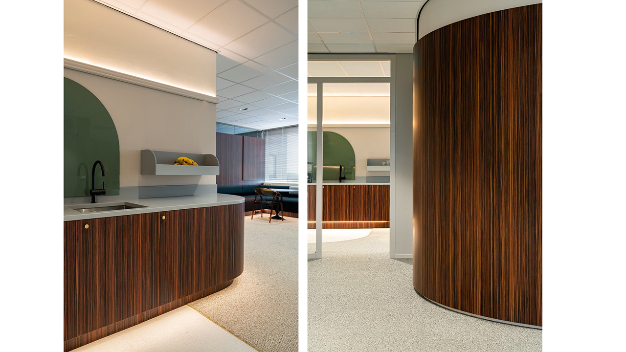
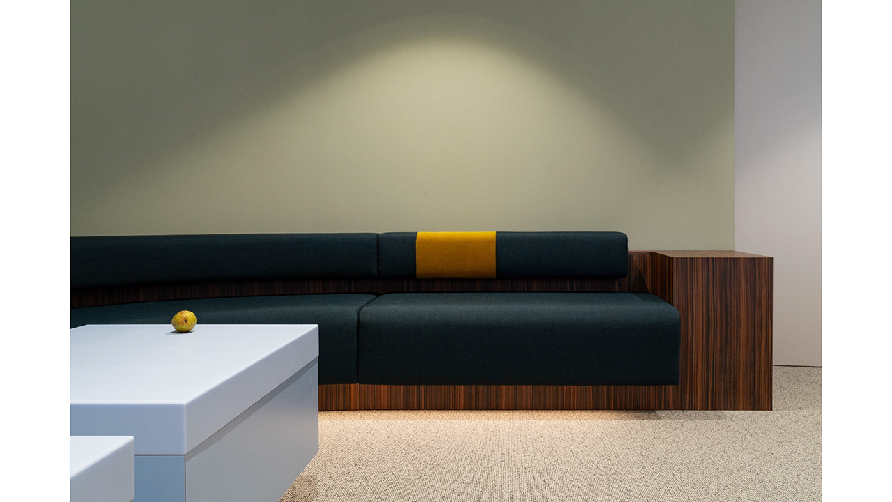
Priogen Energy


Priogen Energy, located in the Westpoort Motion Building in Amsterdam, specializes in the short-term trade in (sustainable) energy. The demanding and intensive work of the employees demands a smart layout whereby on the one hand the dynamic work rhythm (24/7) of the “Traders” is supported and on the other hand space is made for relaxation and discharge. Optimal facilitation consists mainly of creating an “energy flow” that alternates action and stillness. The whole is, as desired, given a “chic” look to give the high quality of the services of Priogen identity.
Photography: Justus Felthuis
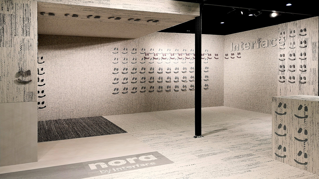
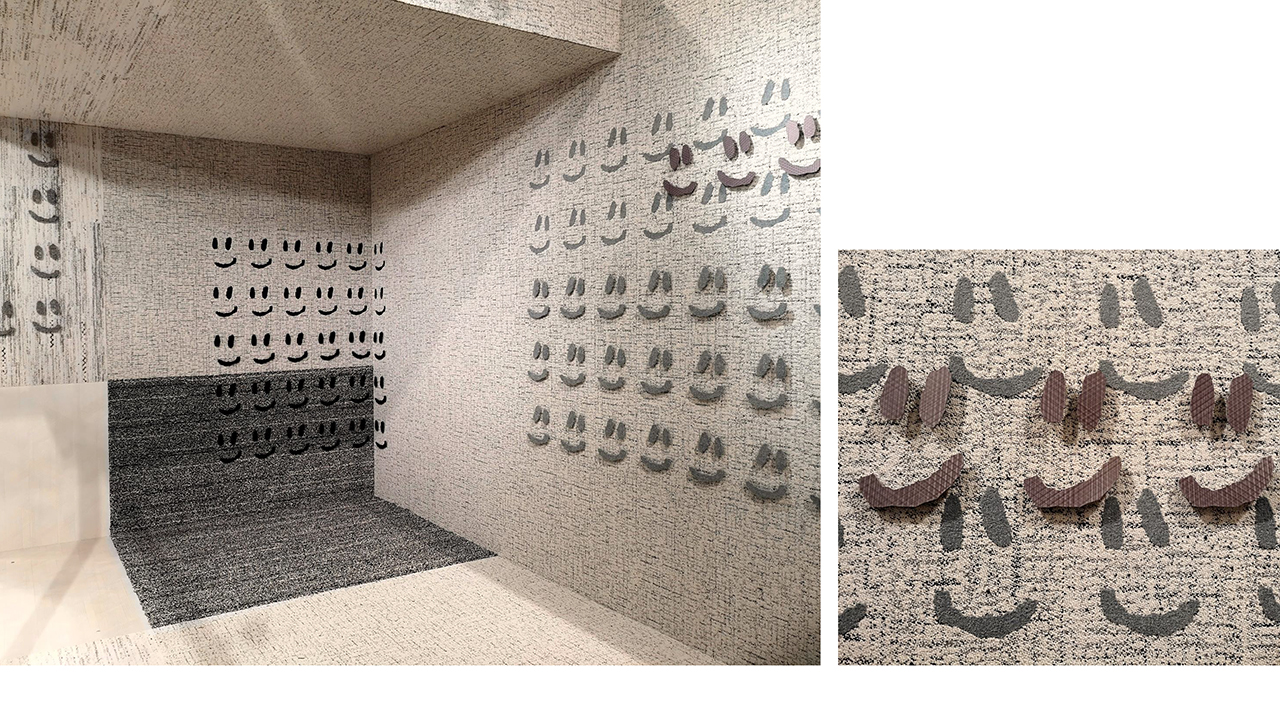
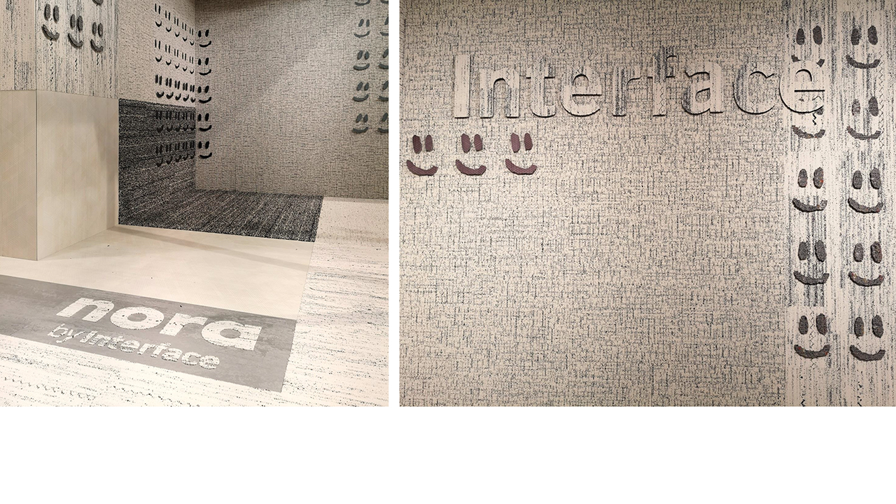
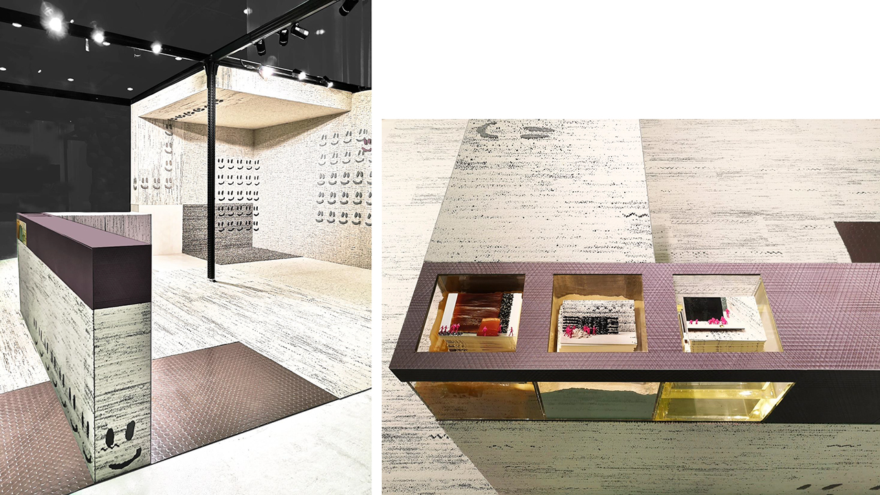
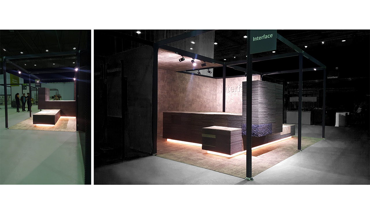
Interface MaterialDistrict 2019


Interface flooring contributes with their products to the creation of “positive spaces”. The latest collections are always designed on the basis of a current theme around sustainability. The theme for the demonstration of this stand, at the MaterialDistrict 2019 fair, are patterns that reflect the synergy between the high-tech and high-touch. Therefore the stand is made accessible by adding a “happy face”.
Photography postcards: J.W. Kaldenbach
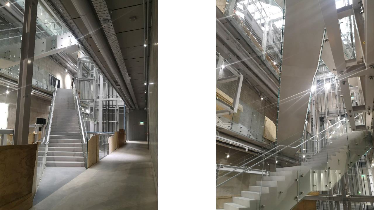
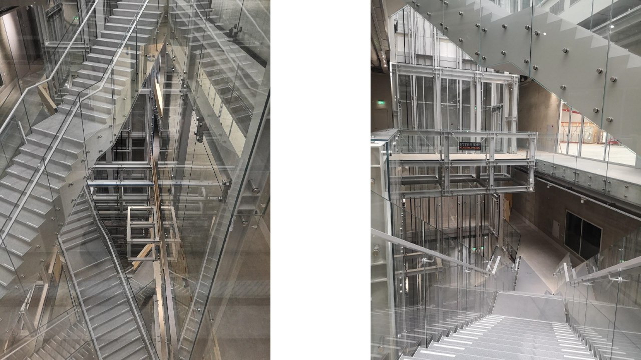
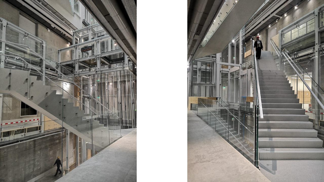
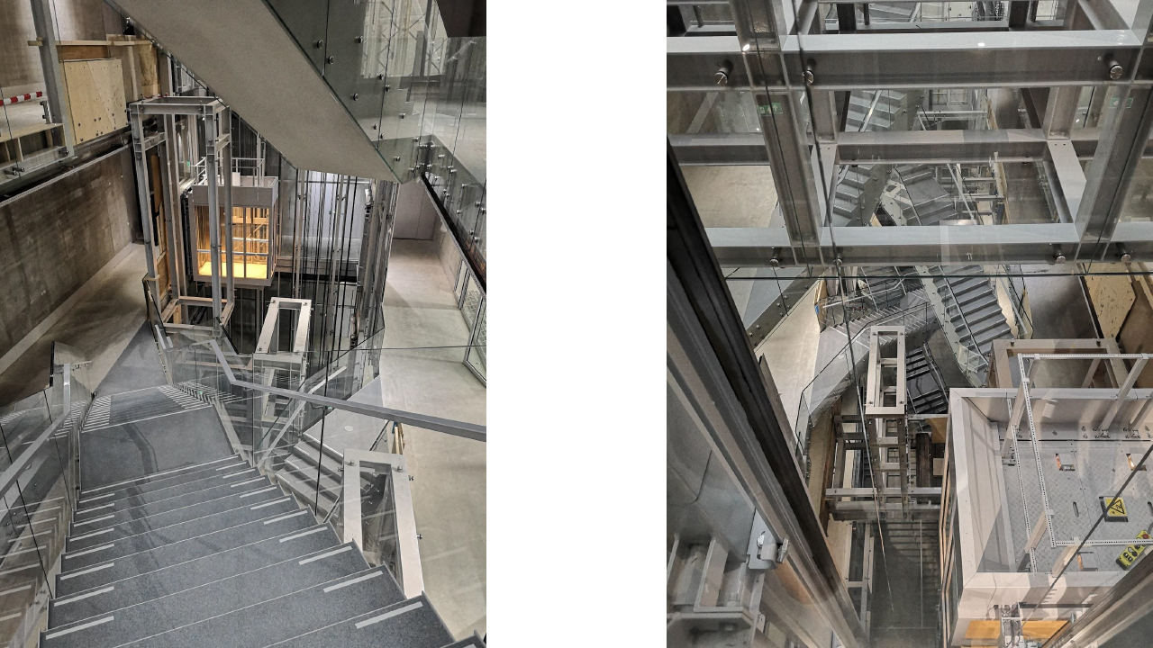
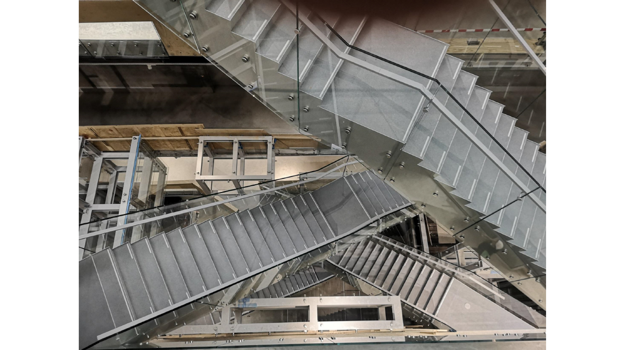
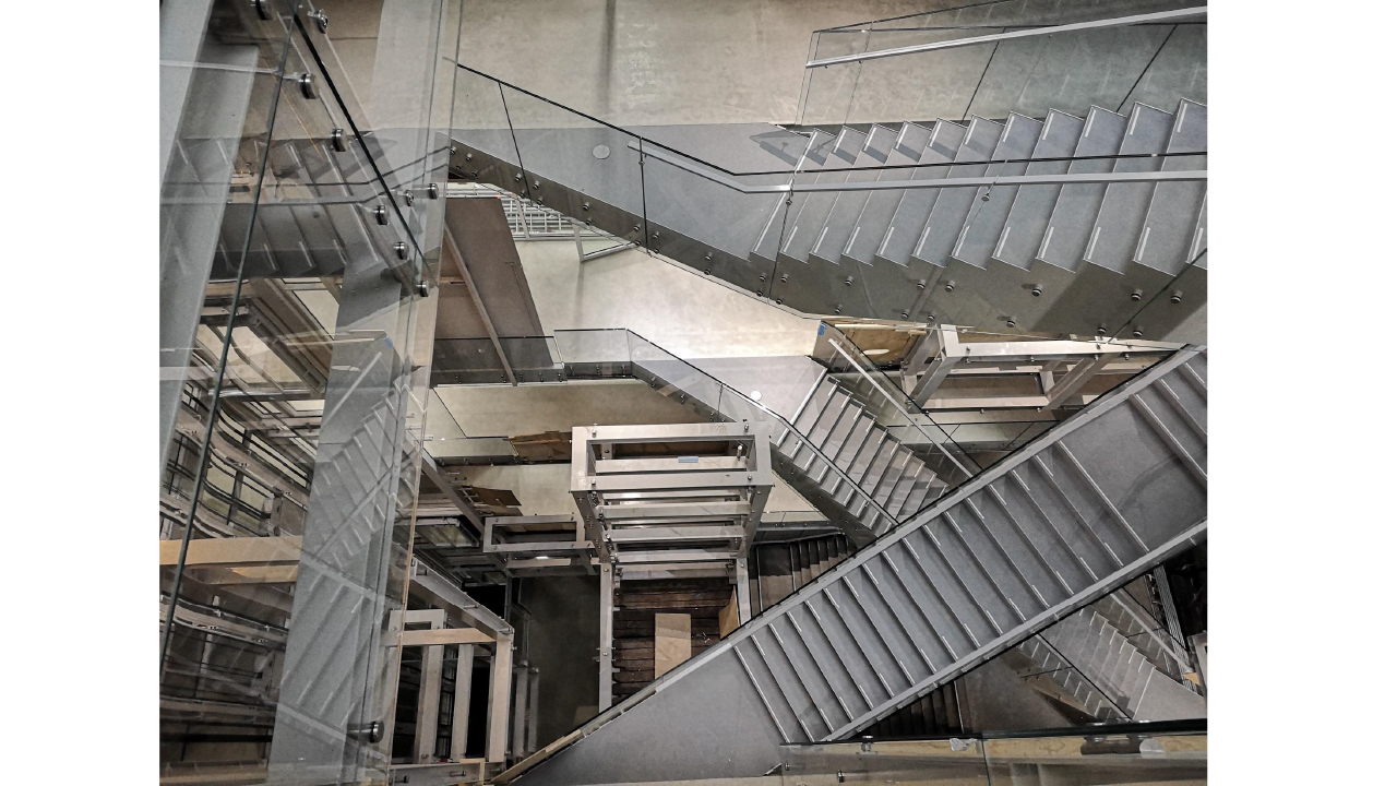
Installation for atrium Collectionbuilding, Rotterdam


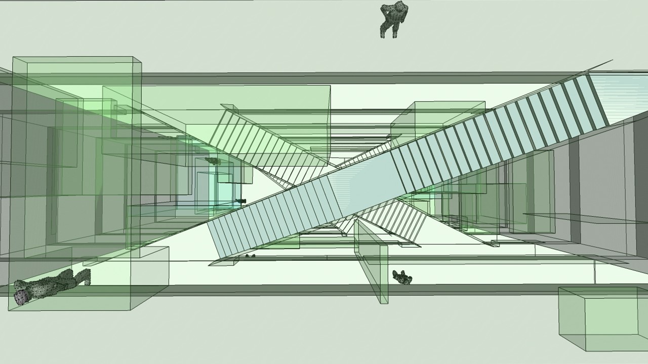
The future Collection Depot designed by MVRDV, next to Museum Boijmans van Beuningen, will be a public building. For the heart of the building, the Atrium, artist Marieke van Diemen, in cooperation with DerksdenBoer Interior Architecture and MVRDV is developing and designing a 3D “Maze” composed from glass and steel. A concept for elements/display cases in a way the collection of the museum is showed in a dazzling and non-hierarchic way.
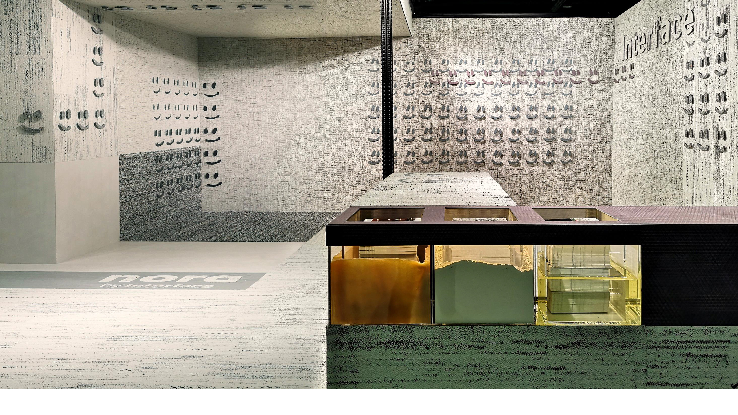
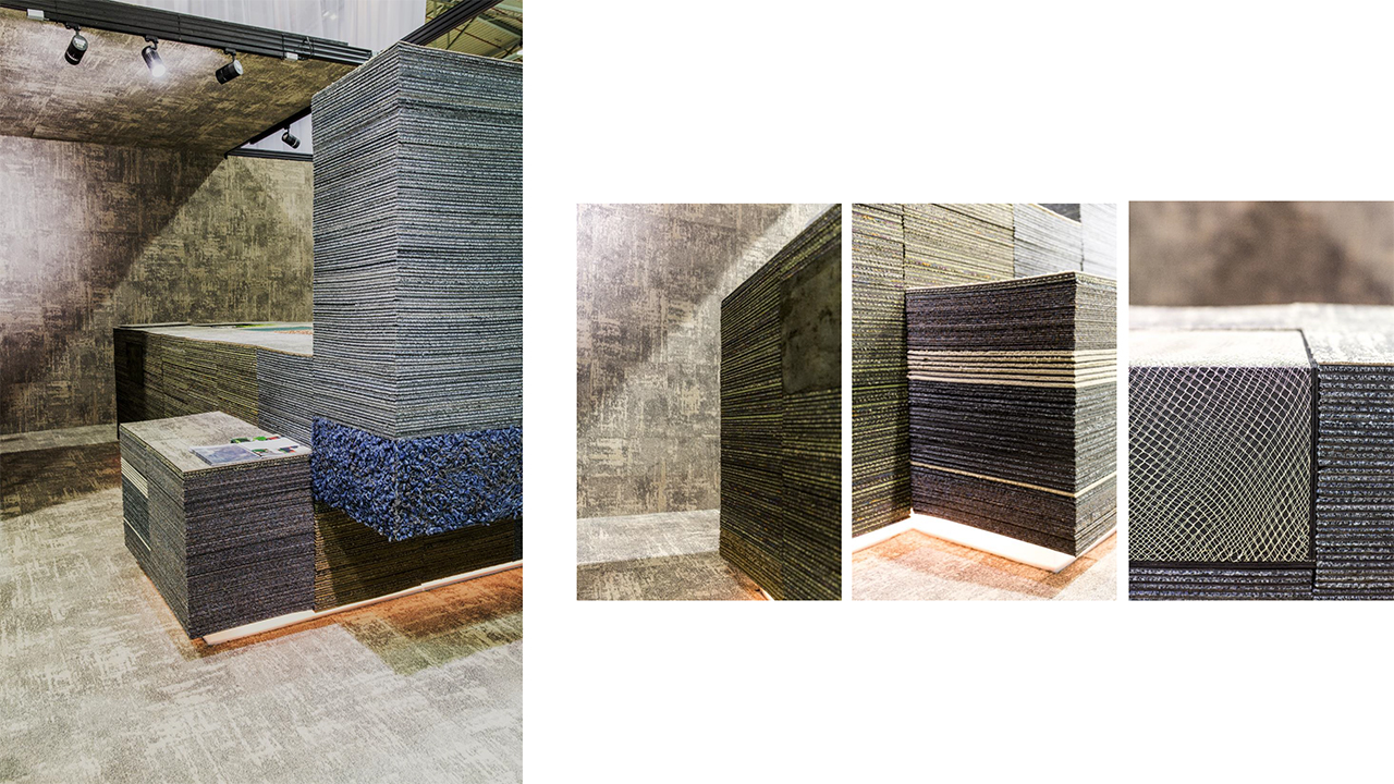
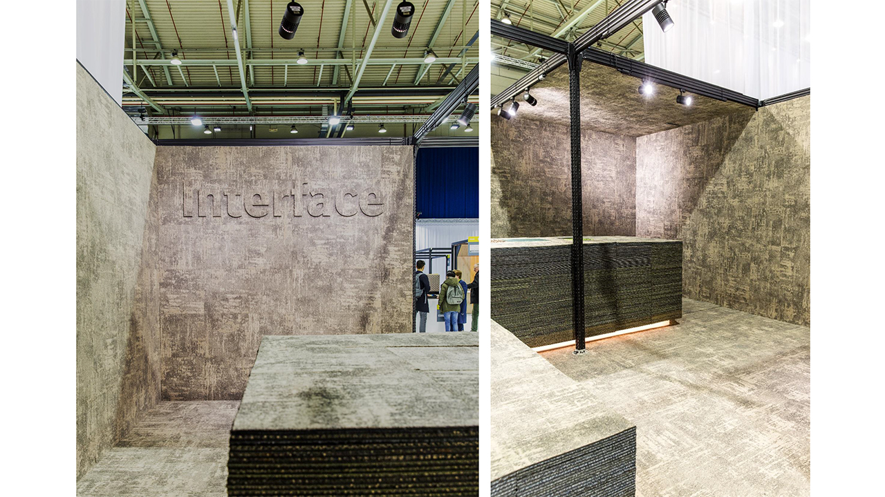
Interface stand Material Xperience 2018
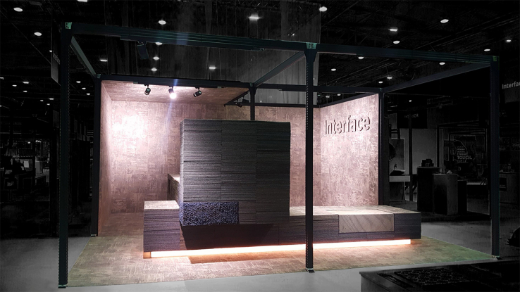
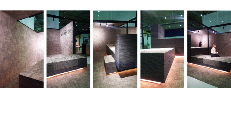


For Interface flooring we designed an exhibition stand to launch their new carpet tile Conscient. This carpet tile is completely composed of recycled materials: re-use of old tiles, old fishing nets, broken car windshields and bio-based castor beans. For already decennia Interface produces sustainable carpet on a very profound way. We shaped a monolith object which is assembled out of the raw materials who form the basis of the tile production. The final result, the Conscient tile, encloses the architectonic stacking as a 3D skin.
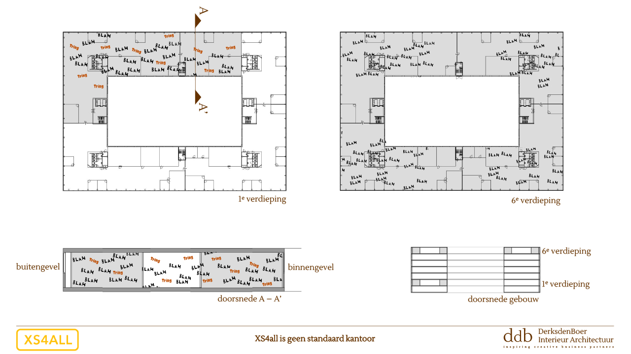
([nl]) XS4ALL Re-styling huisvesting


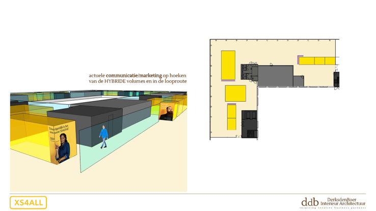


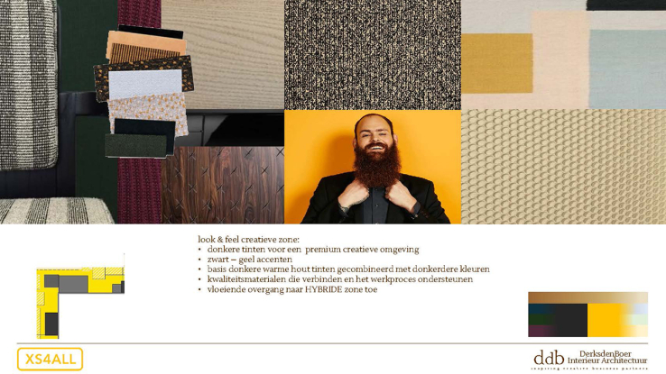
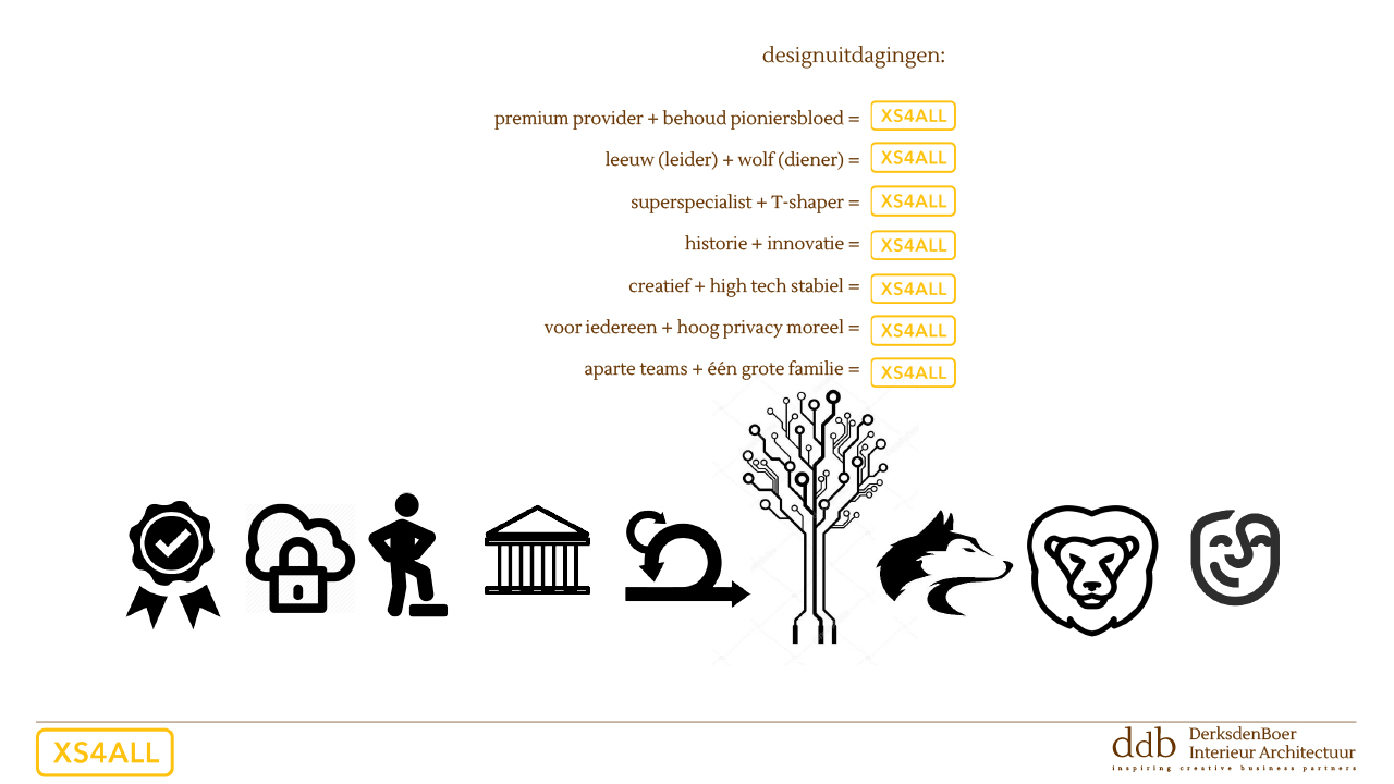
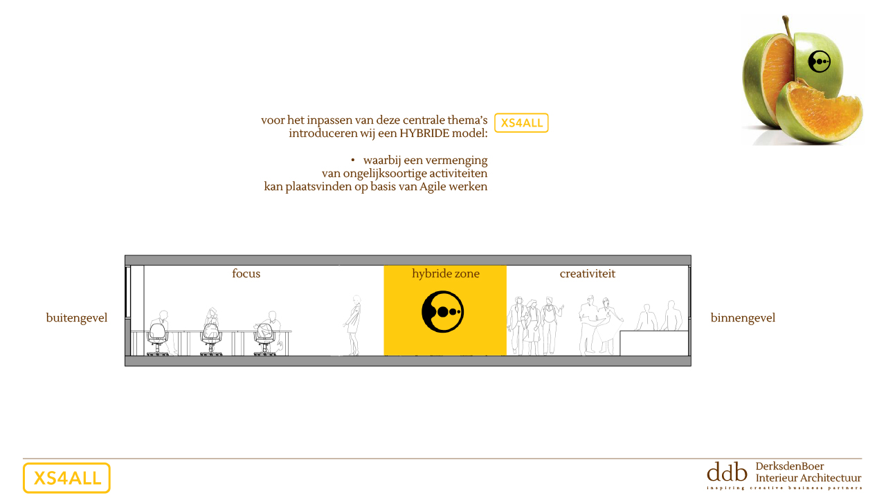
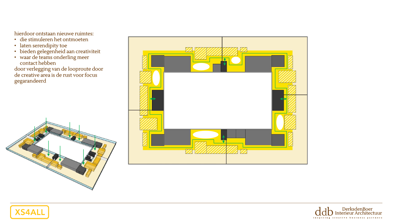
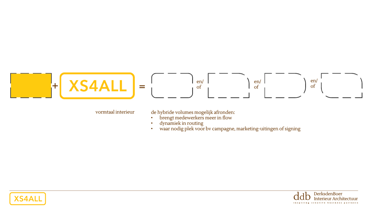
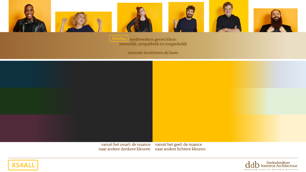
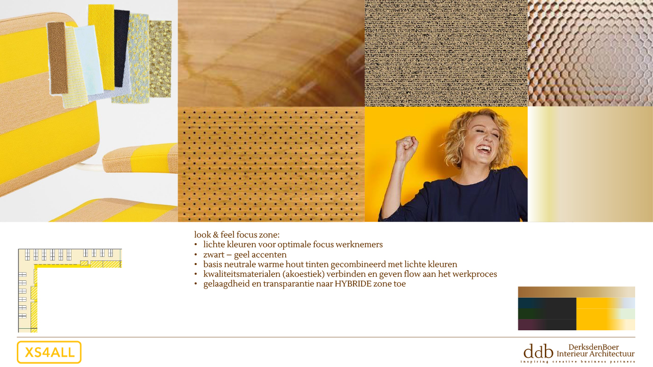
XS4all has asked us to make a design for their office at the Teleport Boulevard at Sloterdijk in Amsterdam. XS4all currently occupies part of the 1st floor and the entire 6th floor, in total there is 5100 m2 of office space with a rectangular layout in which a large atrium is centrally located through the building. Our proposal is to divide the circular square shape into different zones where there is a “hybrid” zone for connecting activities. The effective routing is supported by comfortable acoustics. Where necessary, we have softened the spicy black-yellow branding style. And given the premium character of this top service provider, we gave content through layered and nuanced material use.
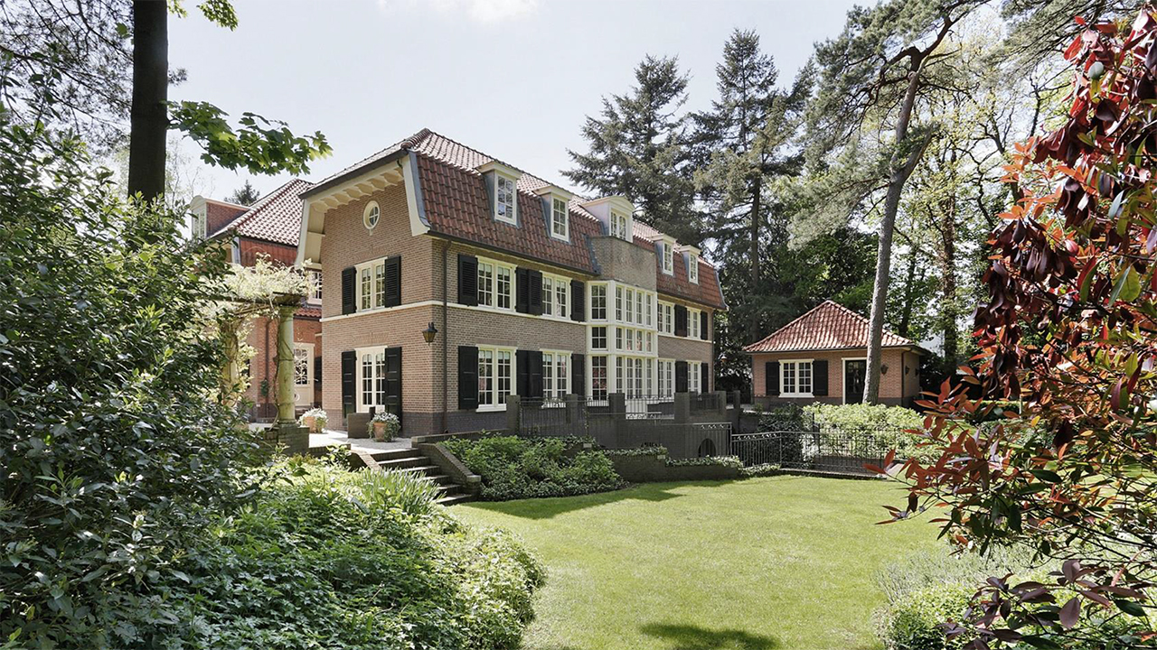
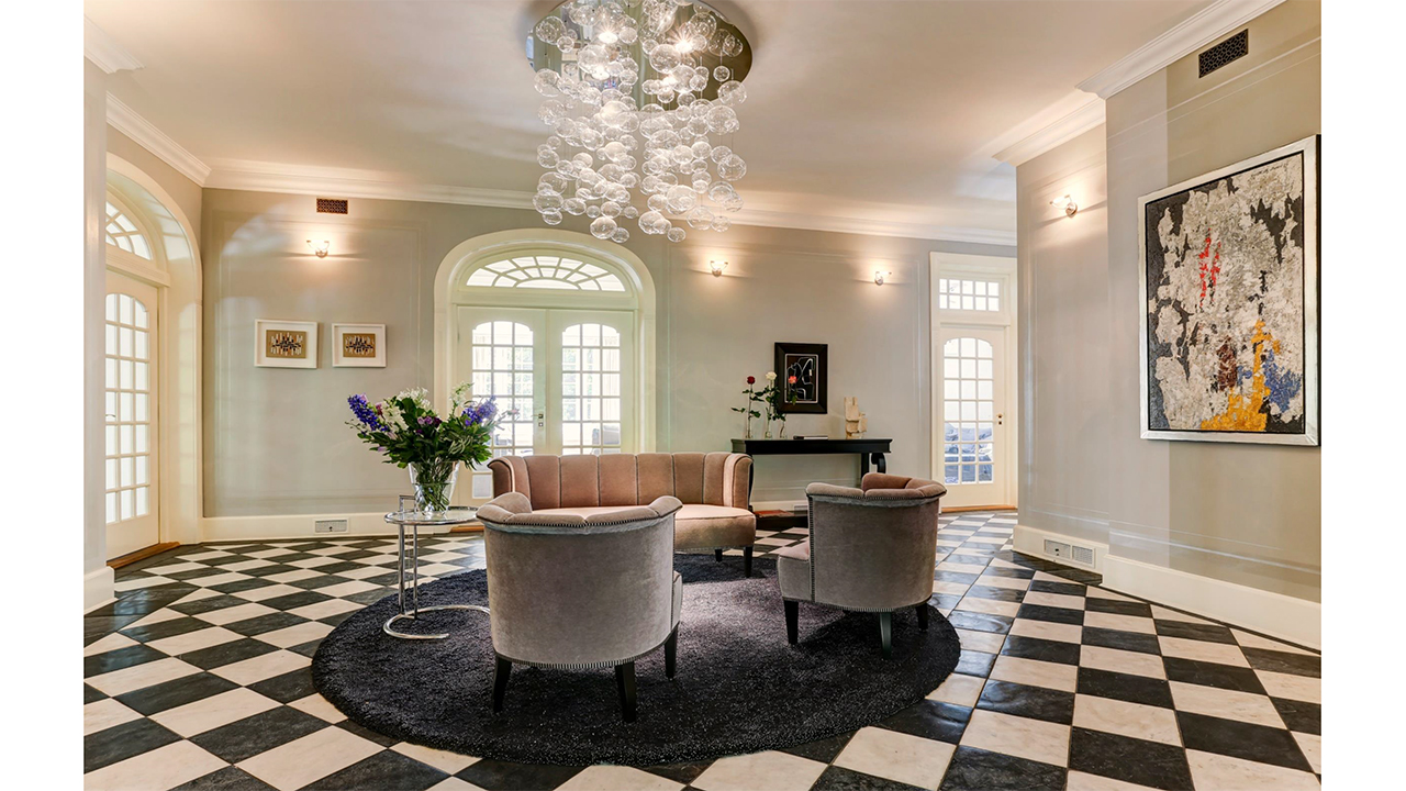
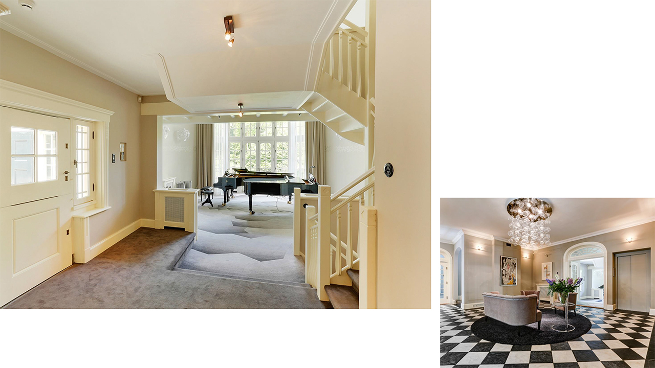
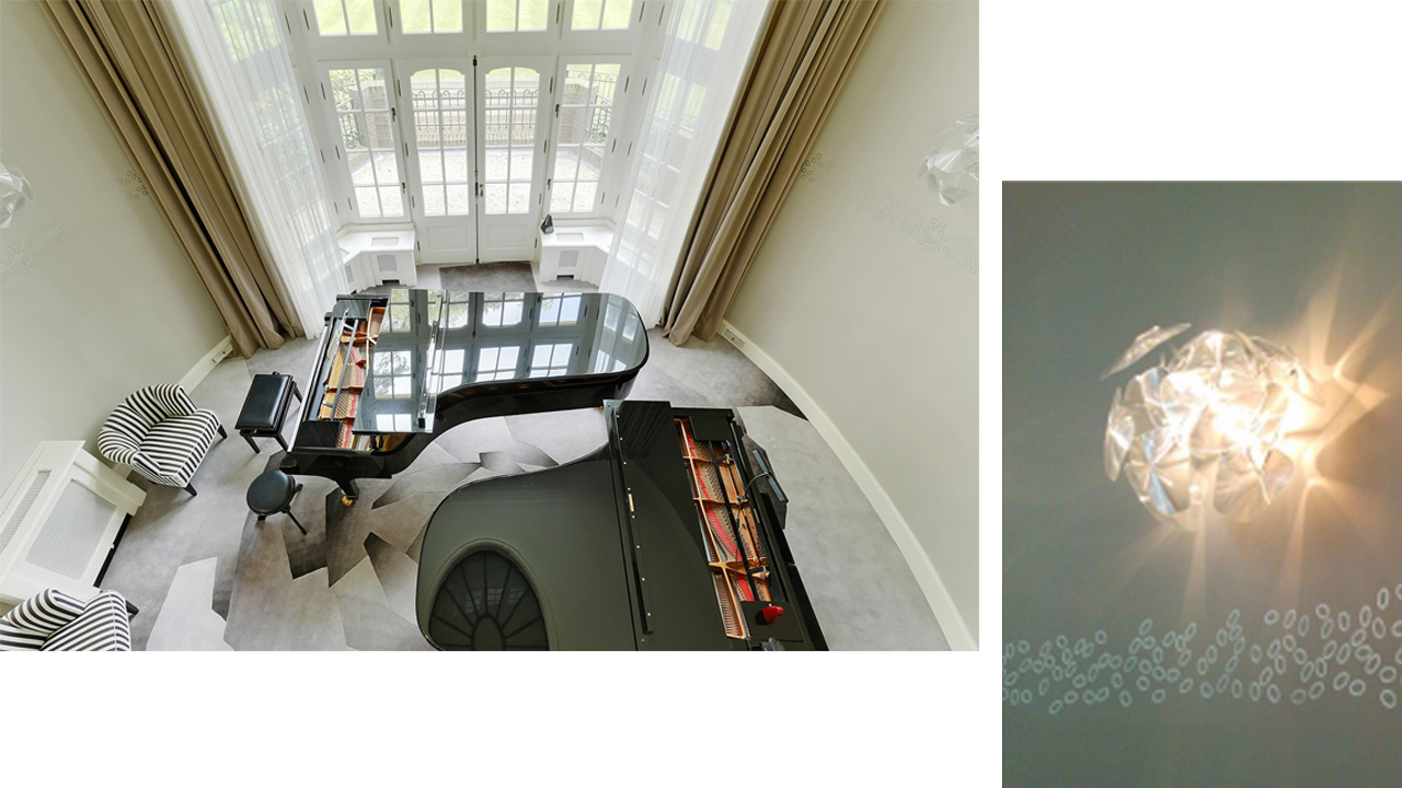
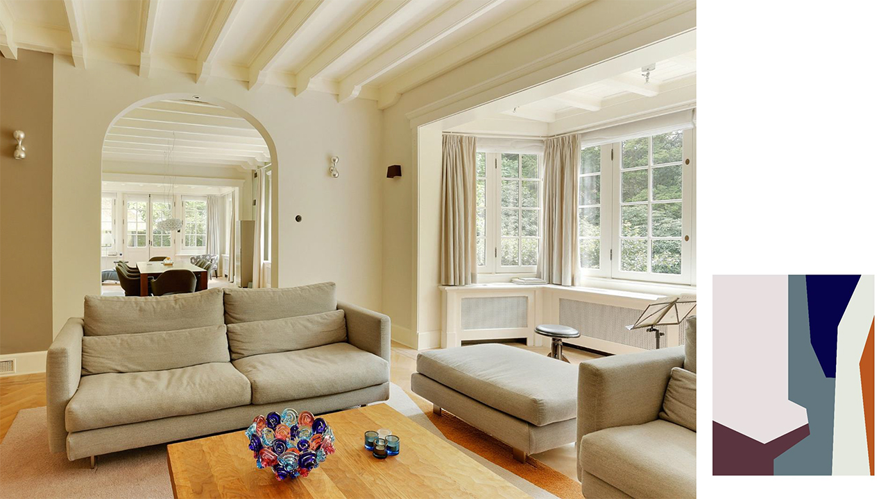
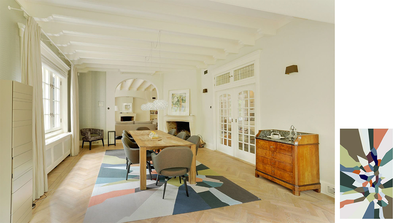
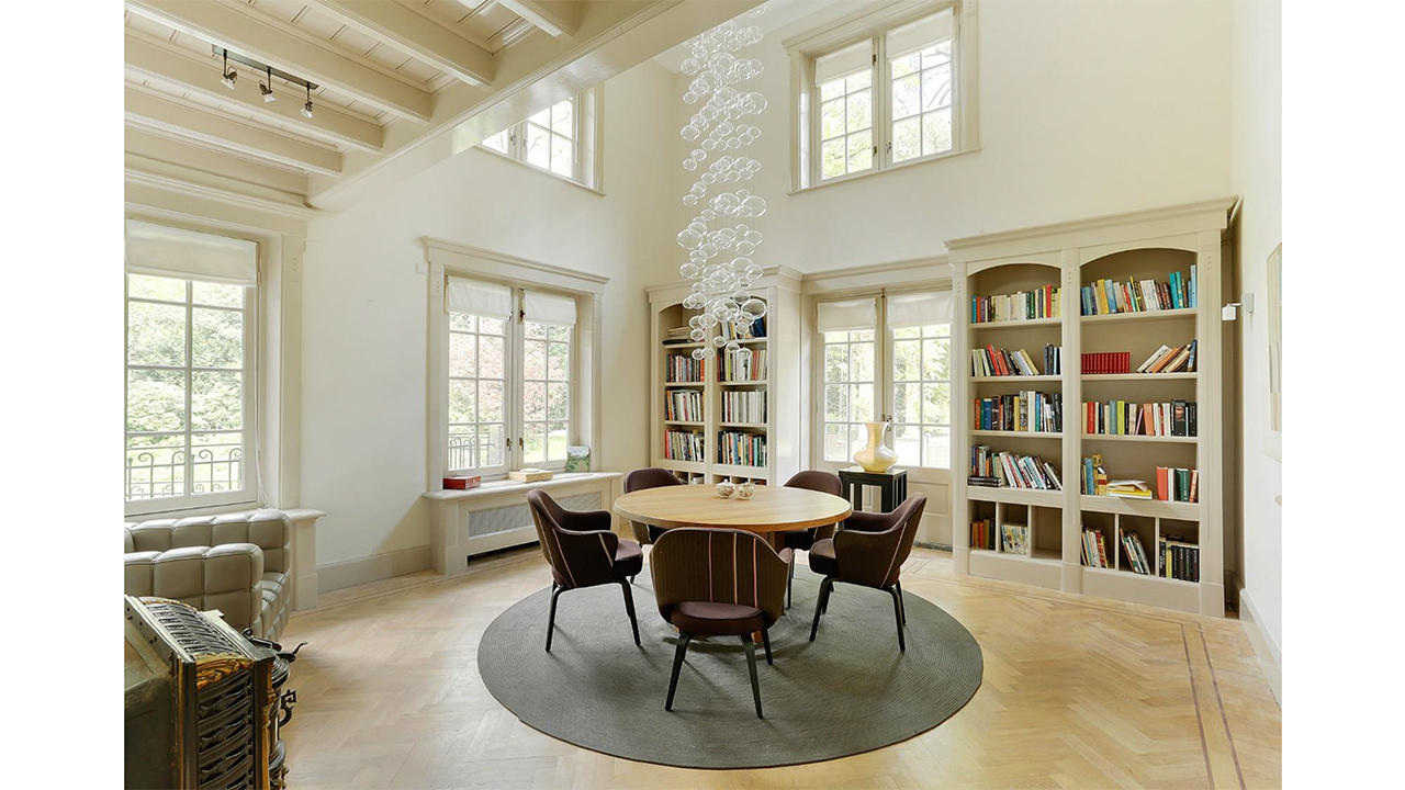
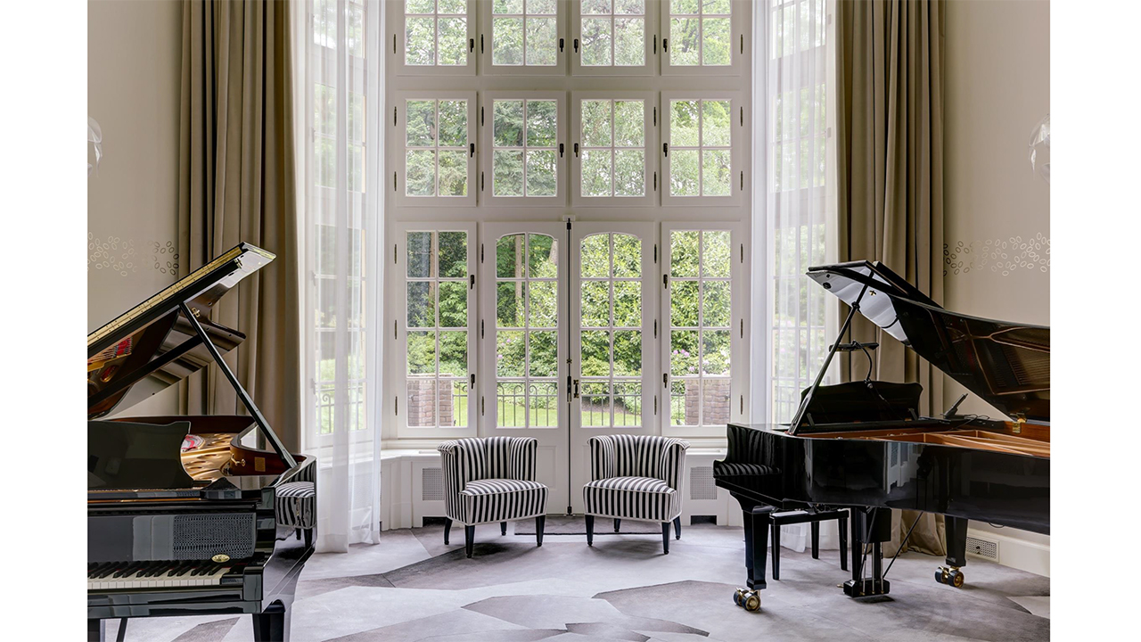
Interior villa, Hilversum


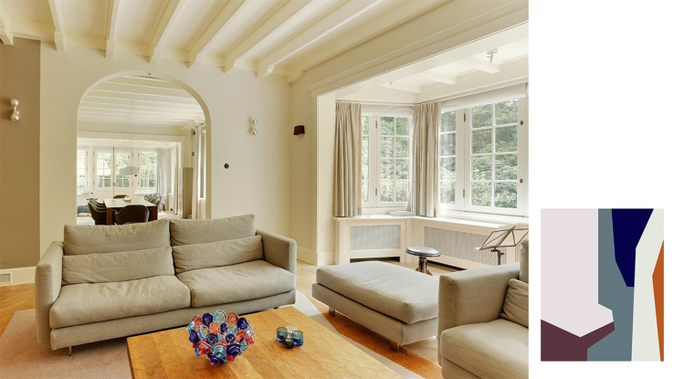


The residents live and work in their stylish villa from 1909 which is recently completely renovated. The re-styling was adapted to the specific requirements of the owners to realise a new use and layout of the space within the existing architecture. The hand-stenciled wall finishes, the complete palette of colours, custom made carpets, exclusive furniture and art consultation are fully adapted to our clients in this personal project. Unique is the “Music Hall” which offers the opportunity to give chamber concerts.
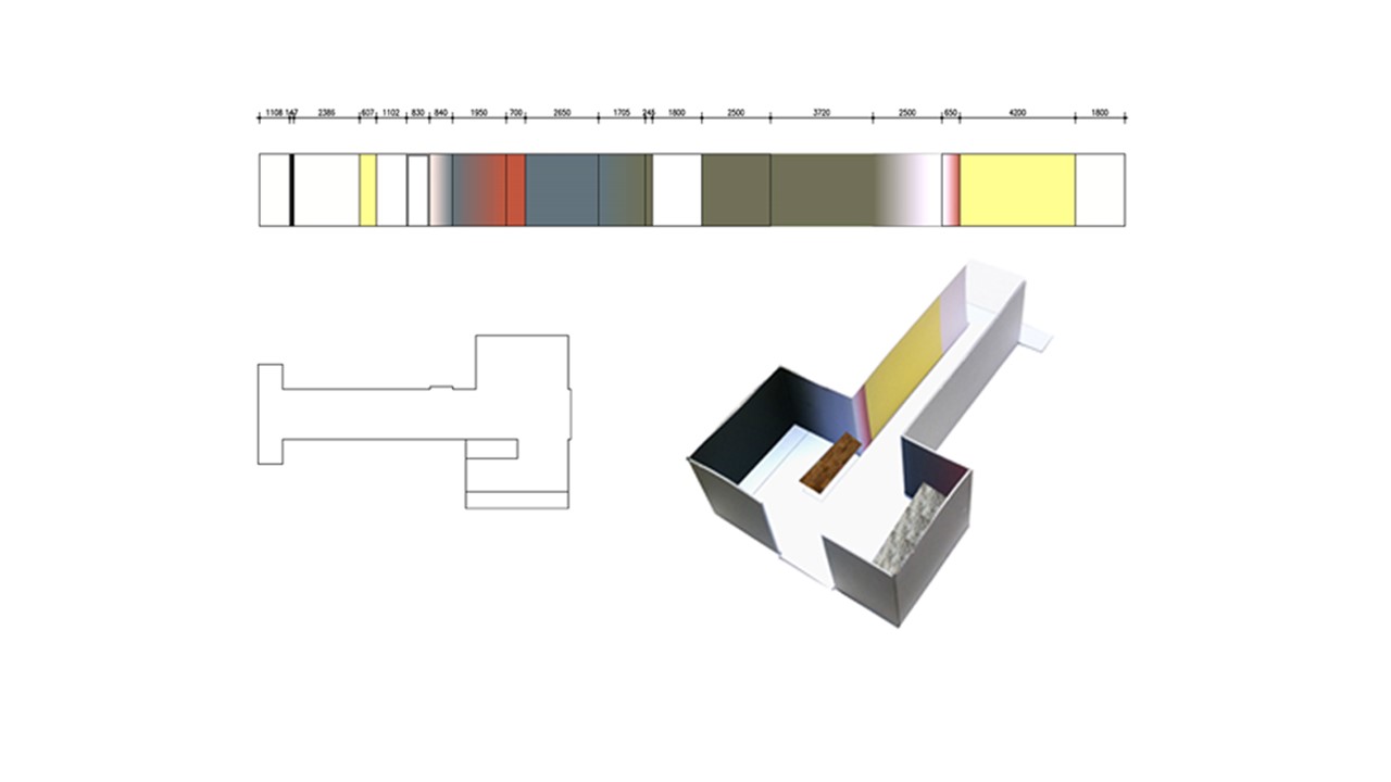
Colour advice commercial building, Amsterdam

For the working place of Photostudio Desiree Dolron we designed a colour concept for the walls in the entrance area. A vertical subdivision of various colours, sometimes a hard gradient, sometimes soft focus. In the corridor the colours are lighter and more spacious; near the pantry/seating area darker and more intimate.
projects Merkx+Girod Architecten, 2004 – 2012
Iris Derks and Chanthal den Boer worked as designers and/or projectleaders at Merkx+Girod Architects on a broad variety of projects.
den Boer joins OIII Architects, 2000
Chanthal den Boer has worked as a designer and/or projectleader at OIII Architects from 2000 until 2006.
Derks joins Dautzenberg & de Jong Architects, 1997
Iris Derks has worked as a designer and/or projectleader at Dautzenberg & de Jong Architects from 1997 until 2004.